系列作品
银奖
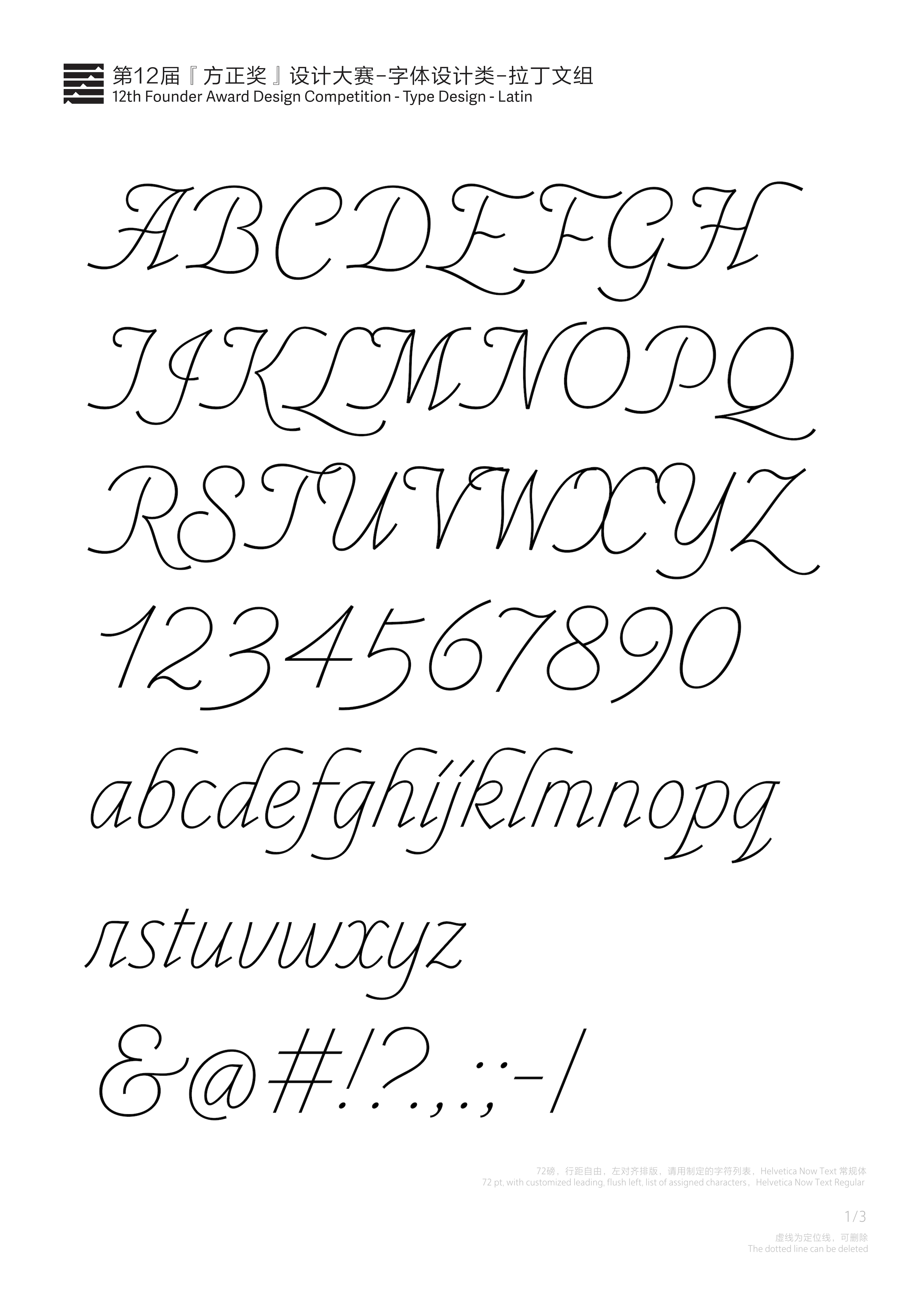
Refineme(系列)
银奖
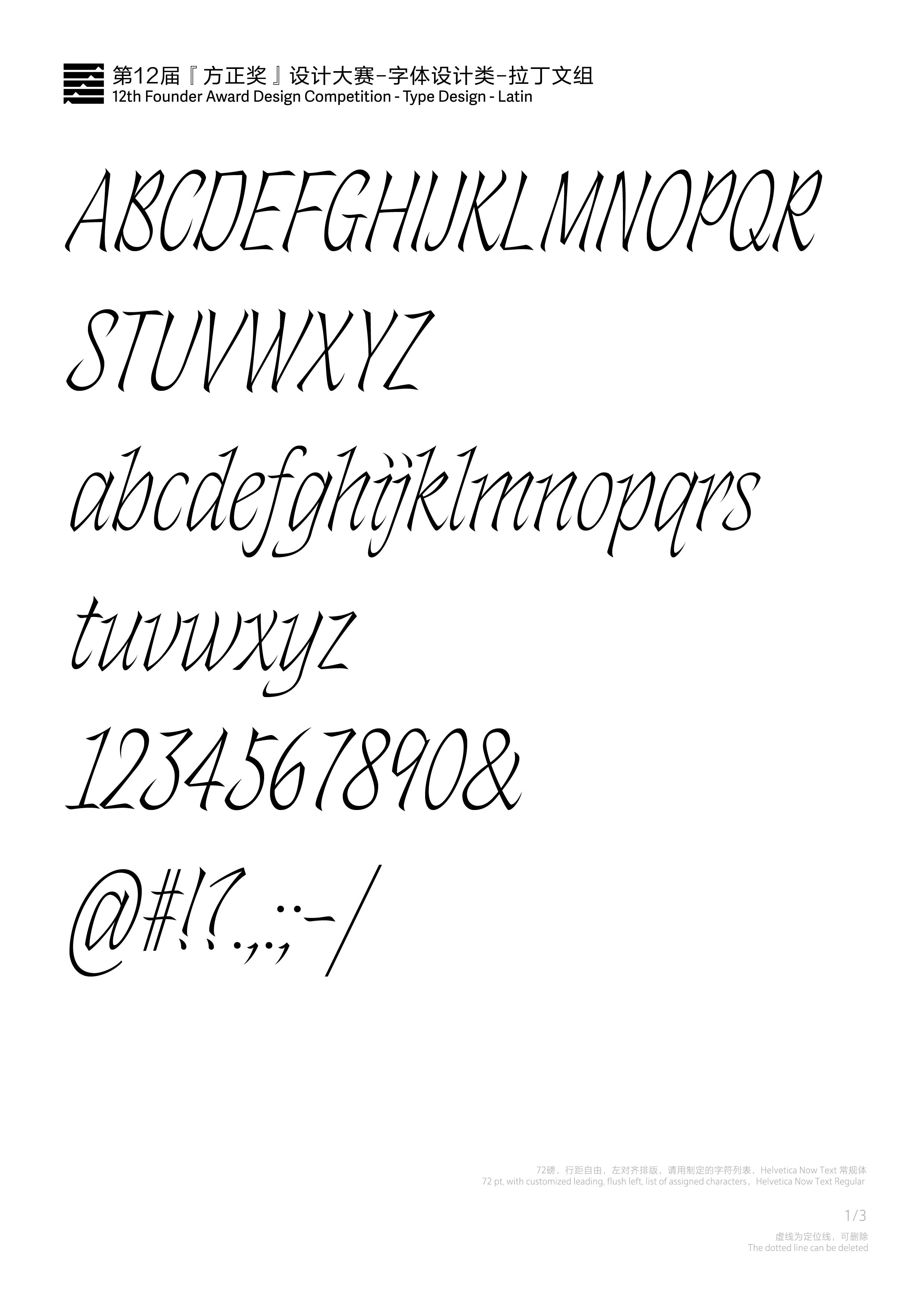
Orvelte
铜奖
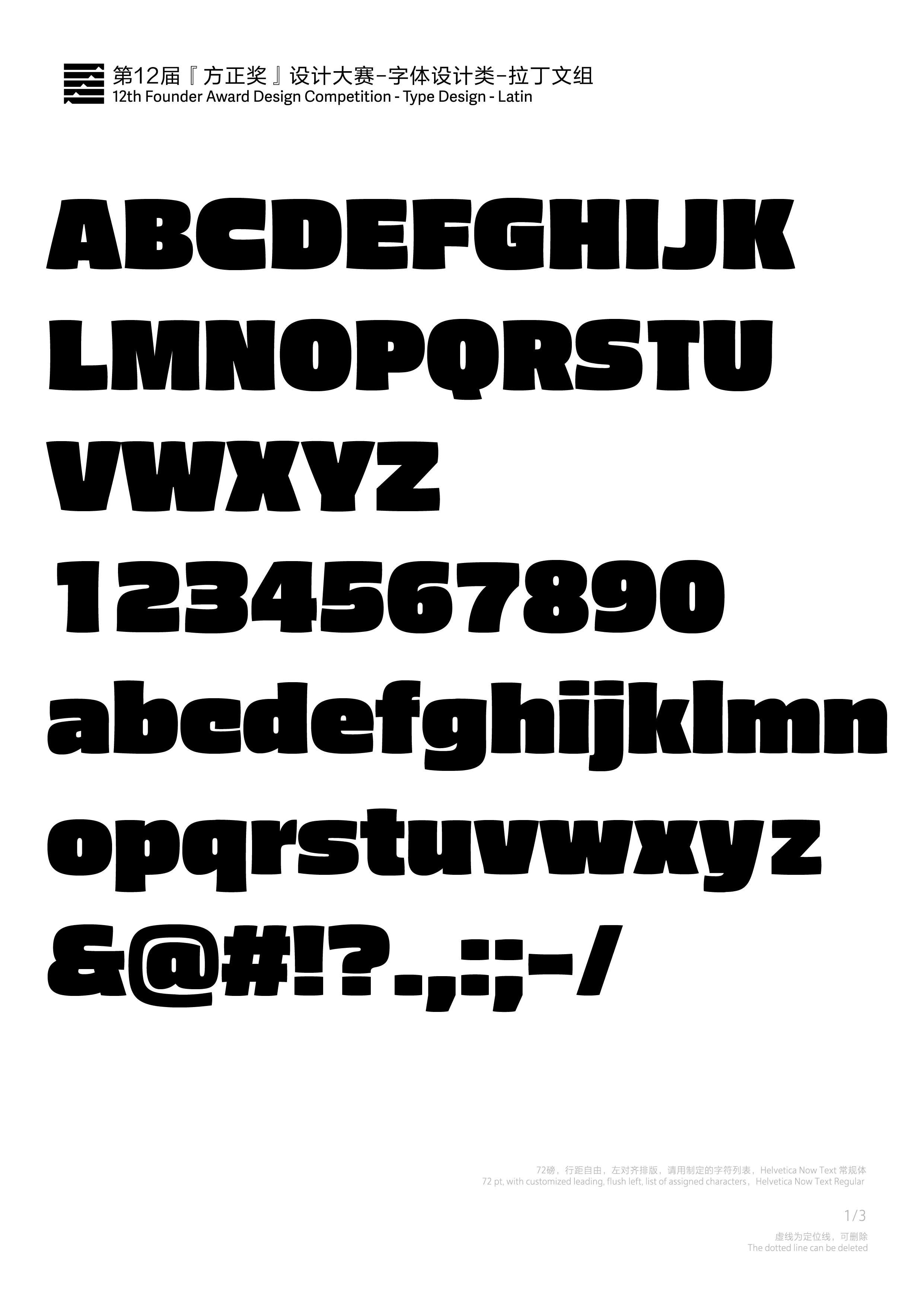
Hamington
铜奖
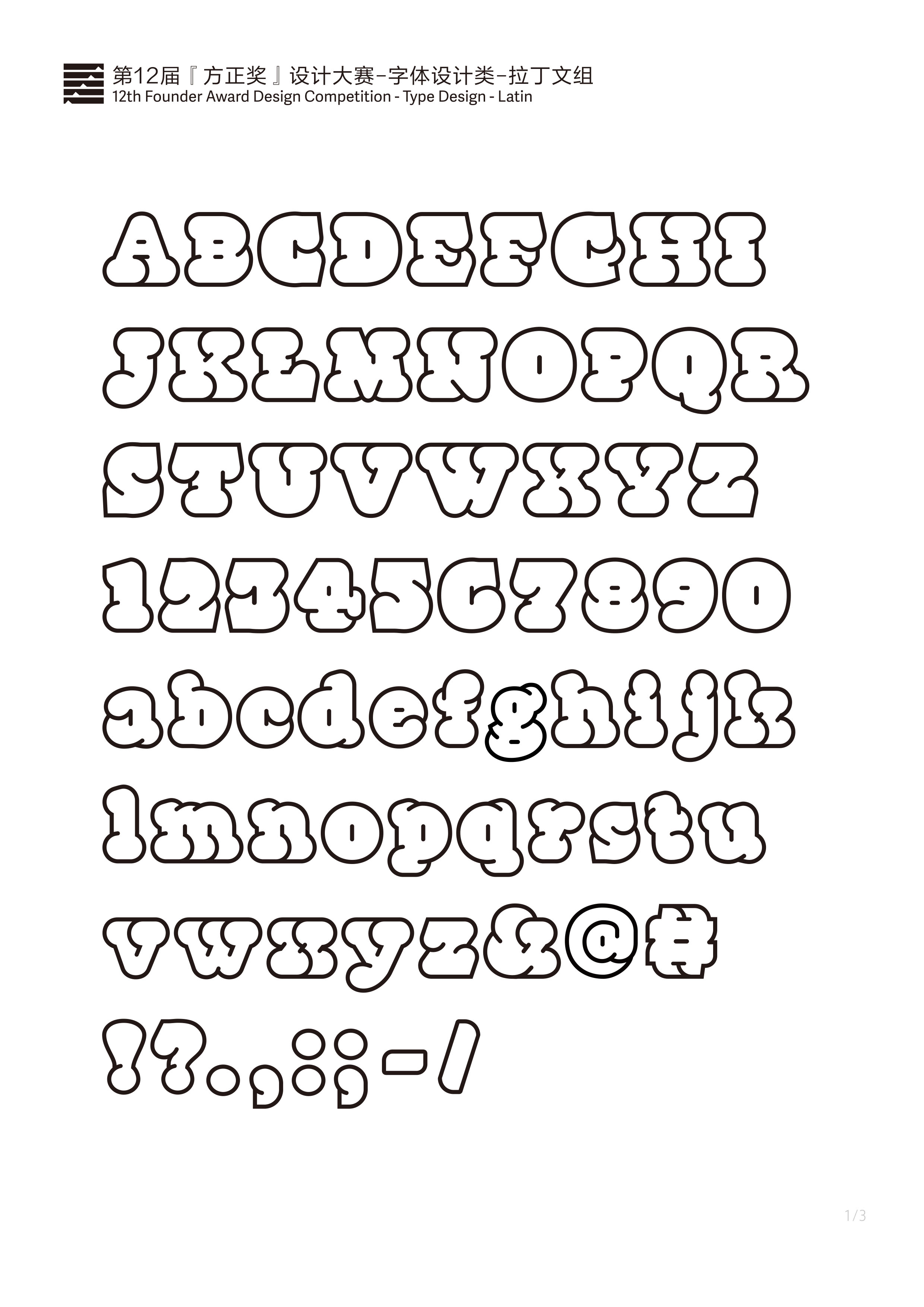
Jin Imitation
铜奖
DwenDwen
优秀奖
Fatten up
优秀奖
Eleganza Circulus
优秀奖
纸锁琼文
优秀奖
New Rotunda
优秀奖
厚朴(Houpu)
最佳奖
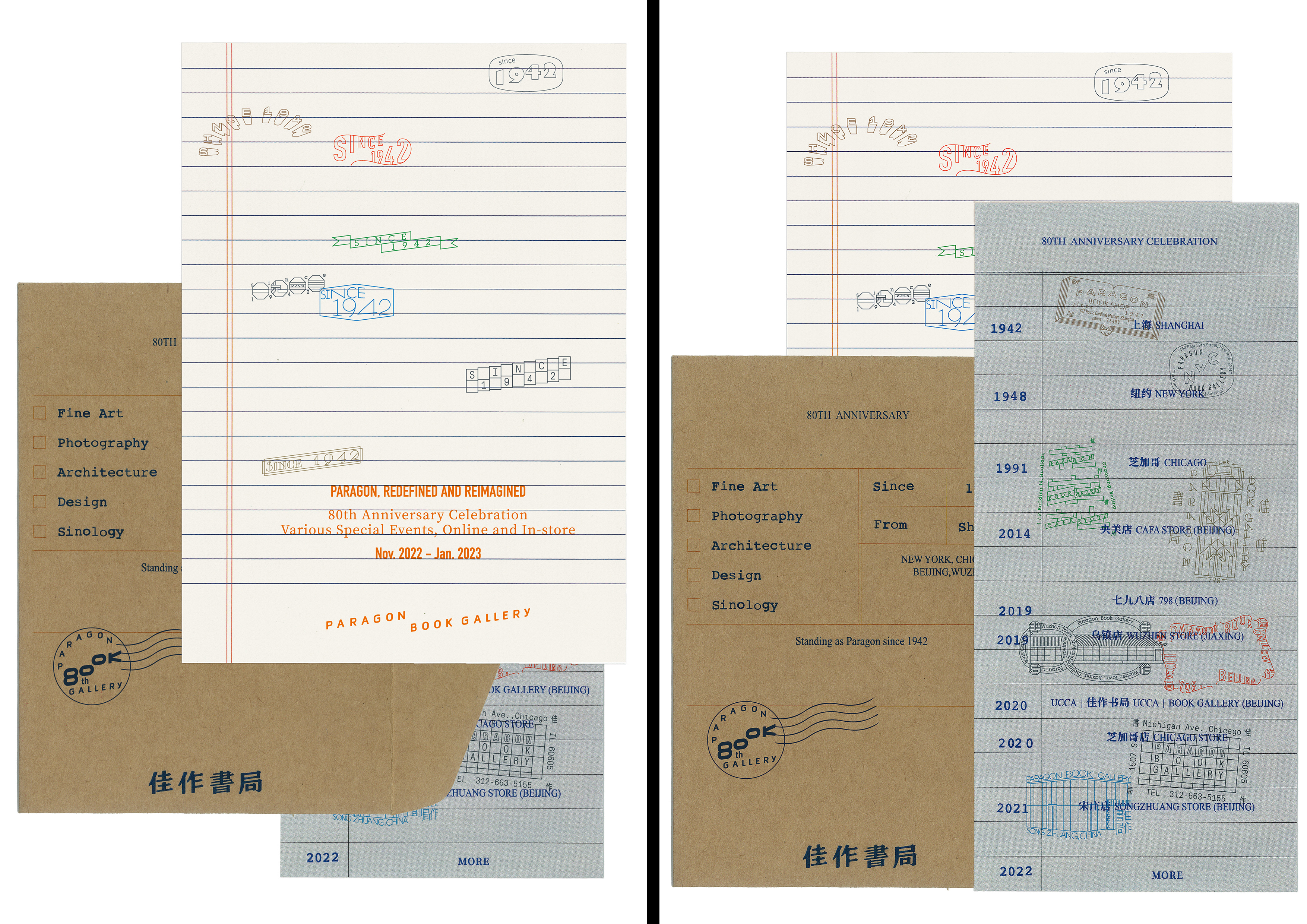
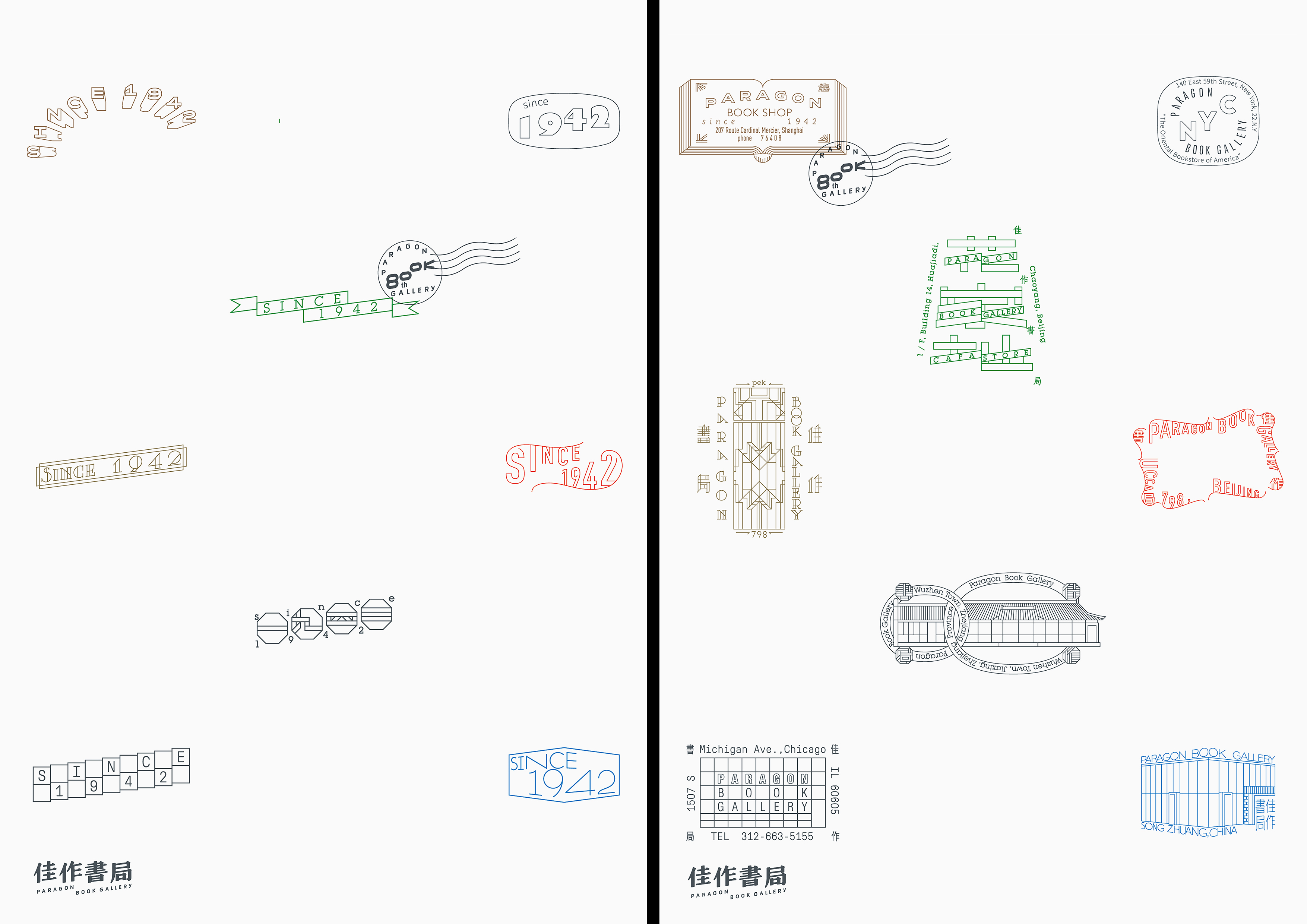
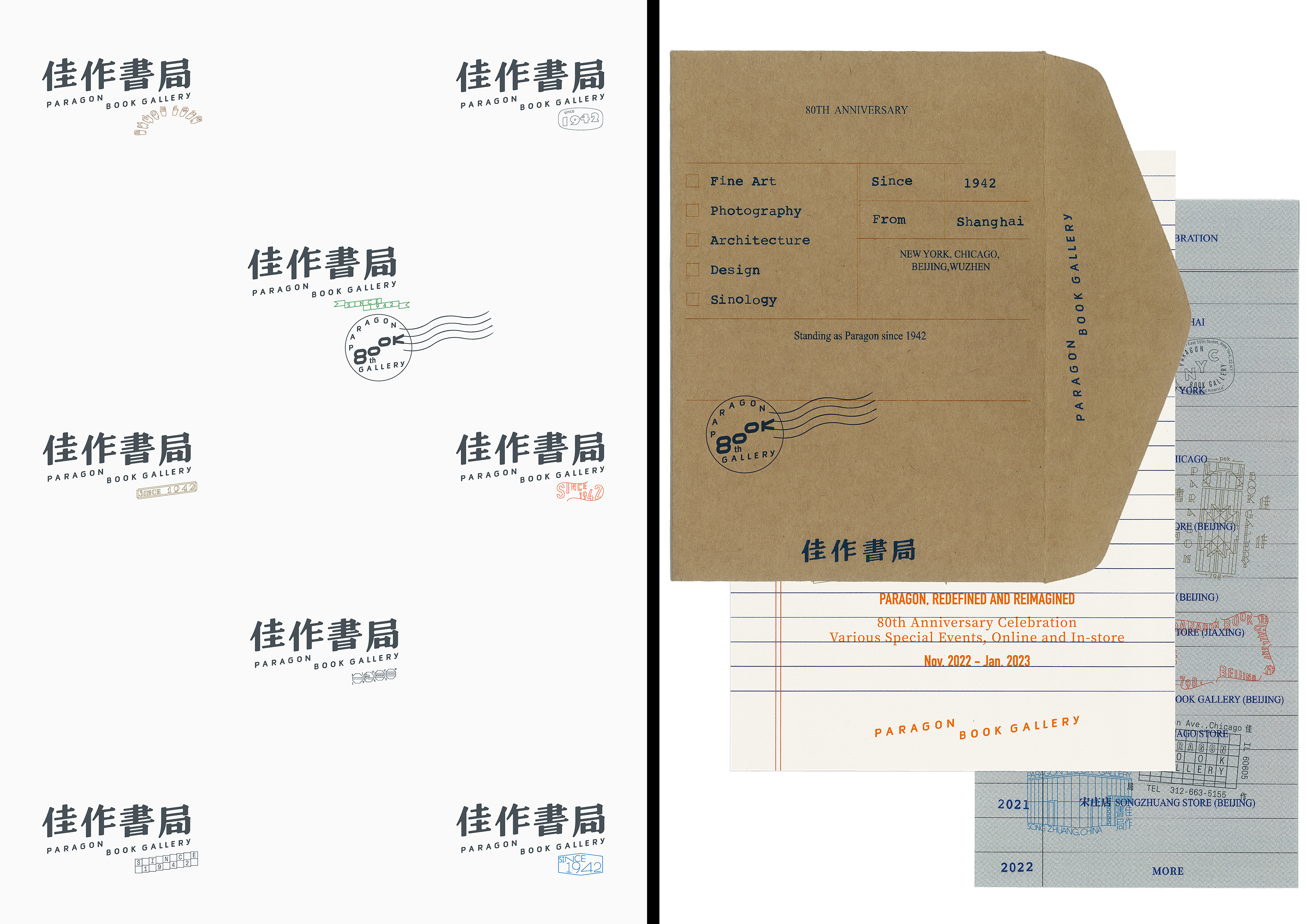
佳作书局
提名奖
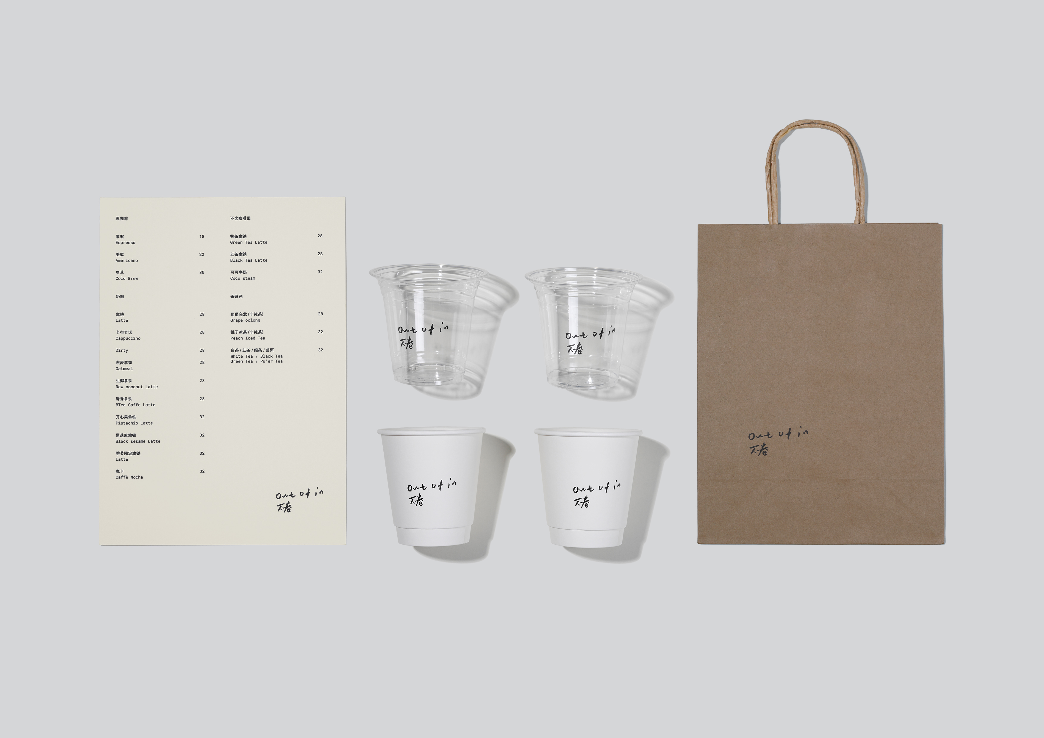
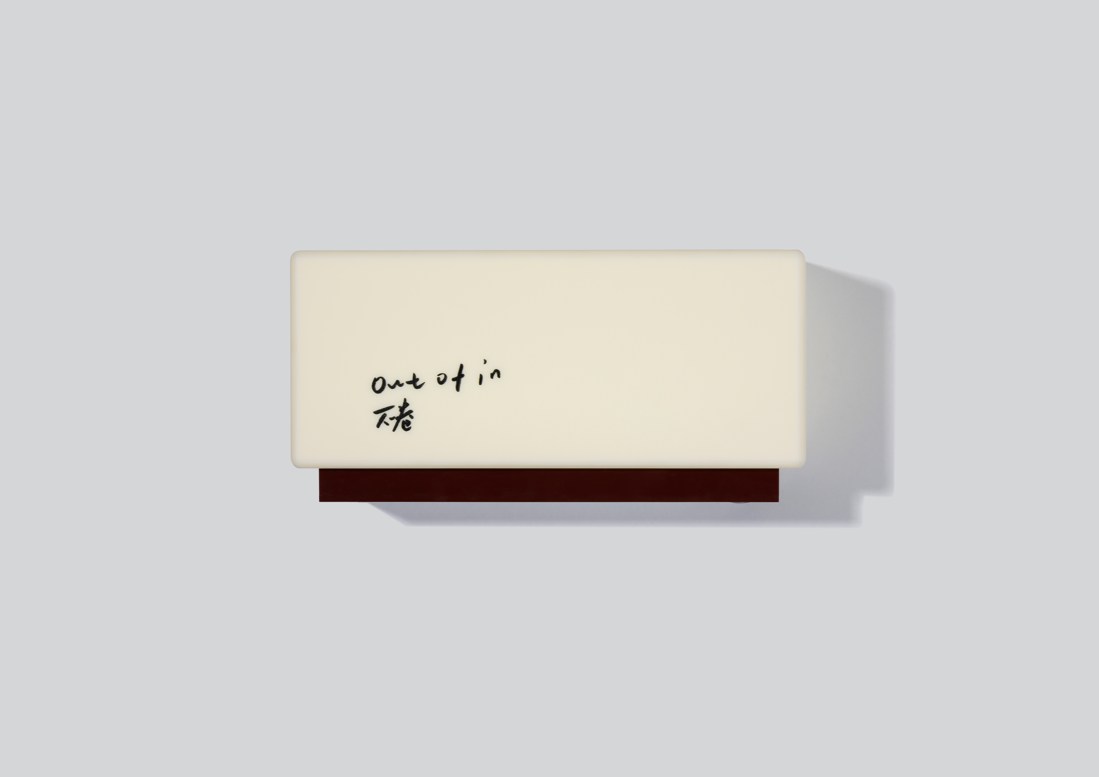
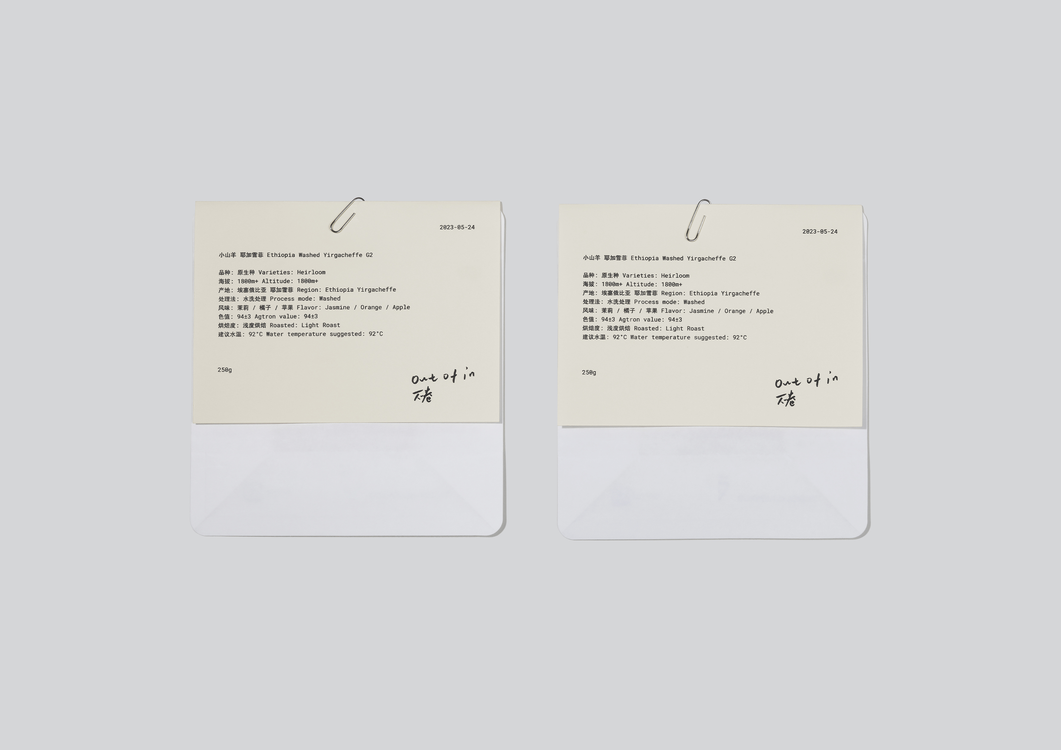
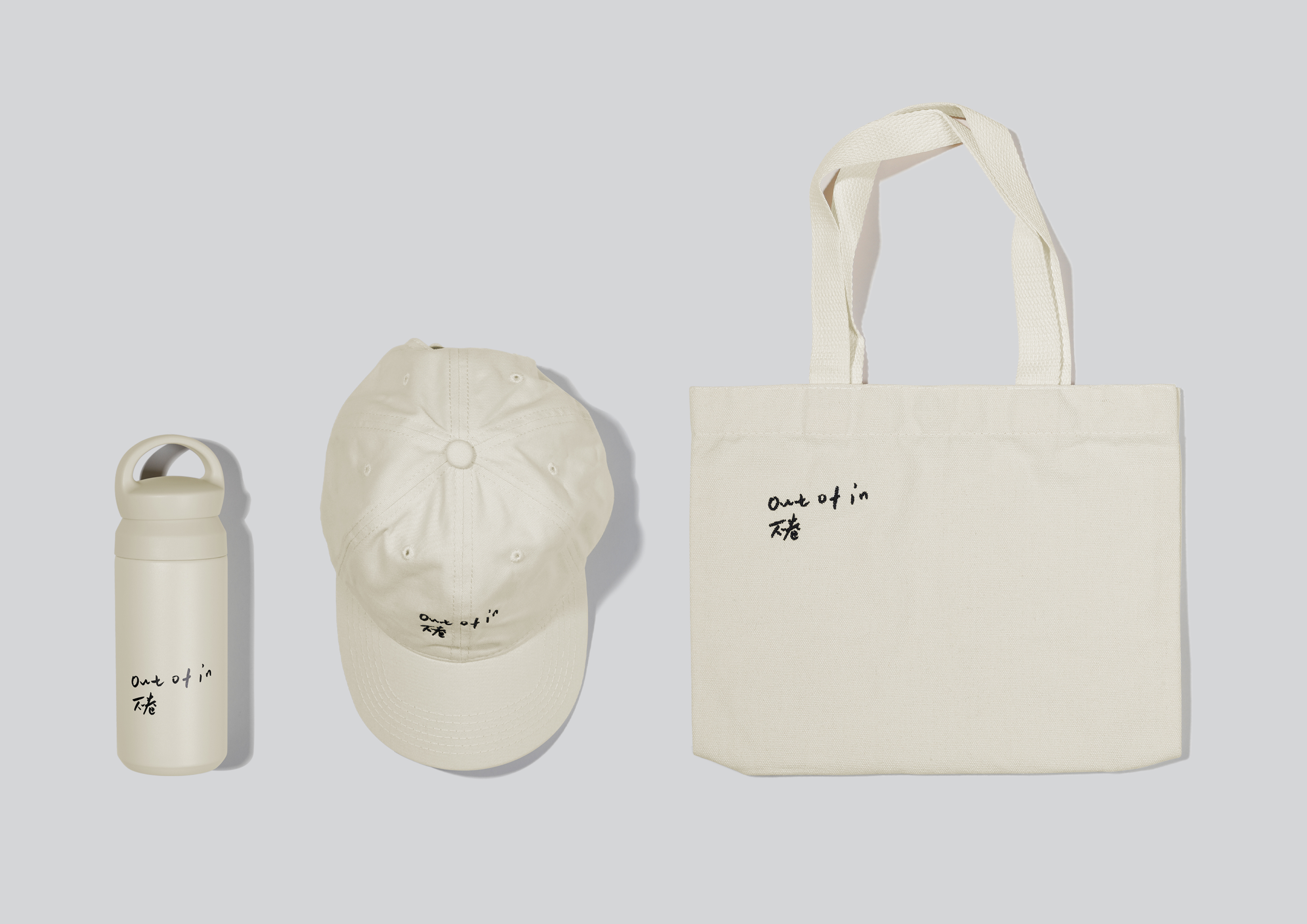
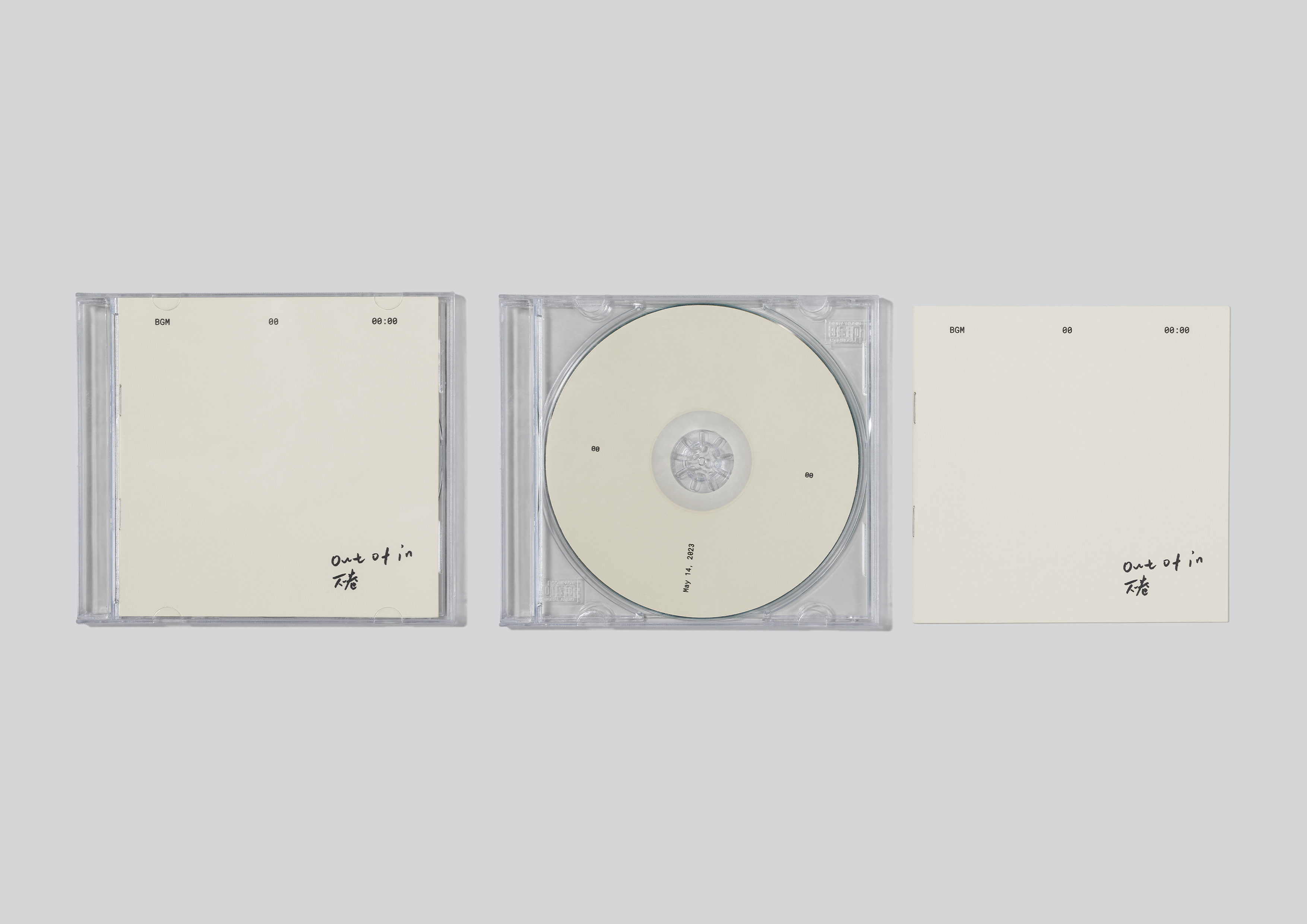
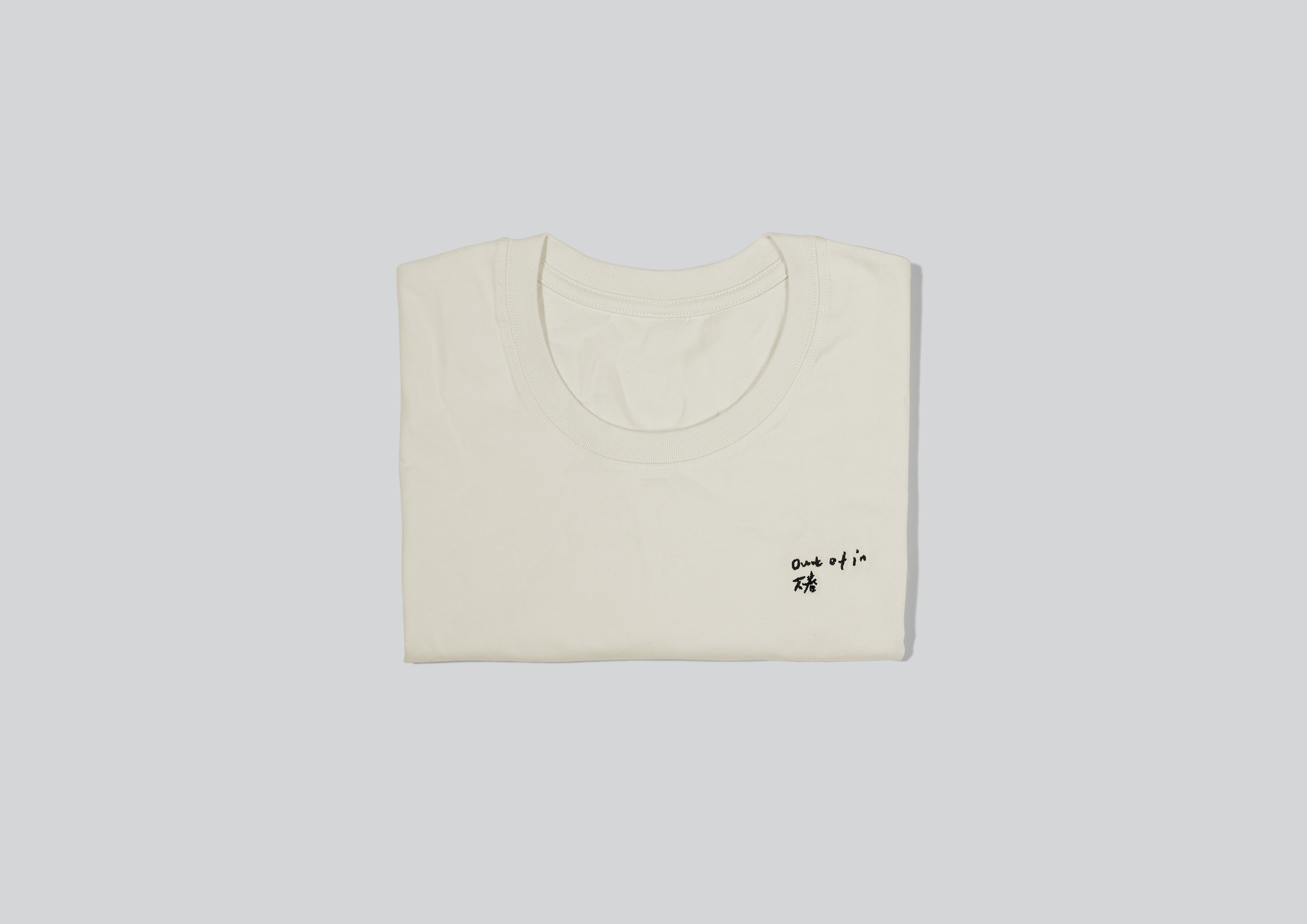
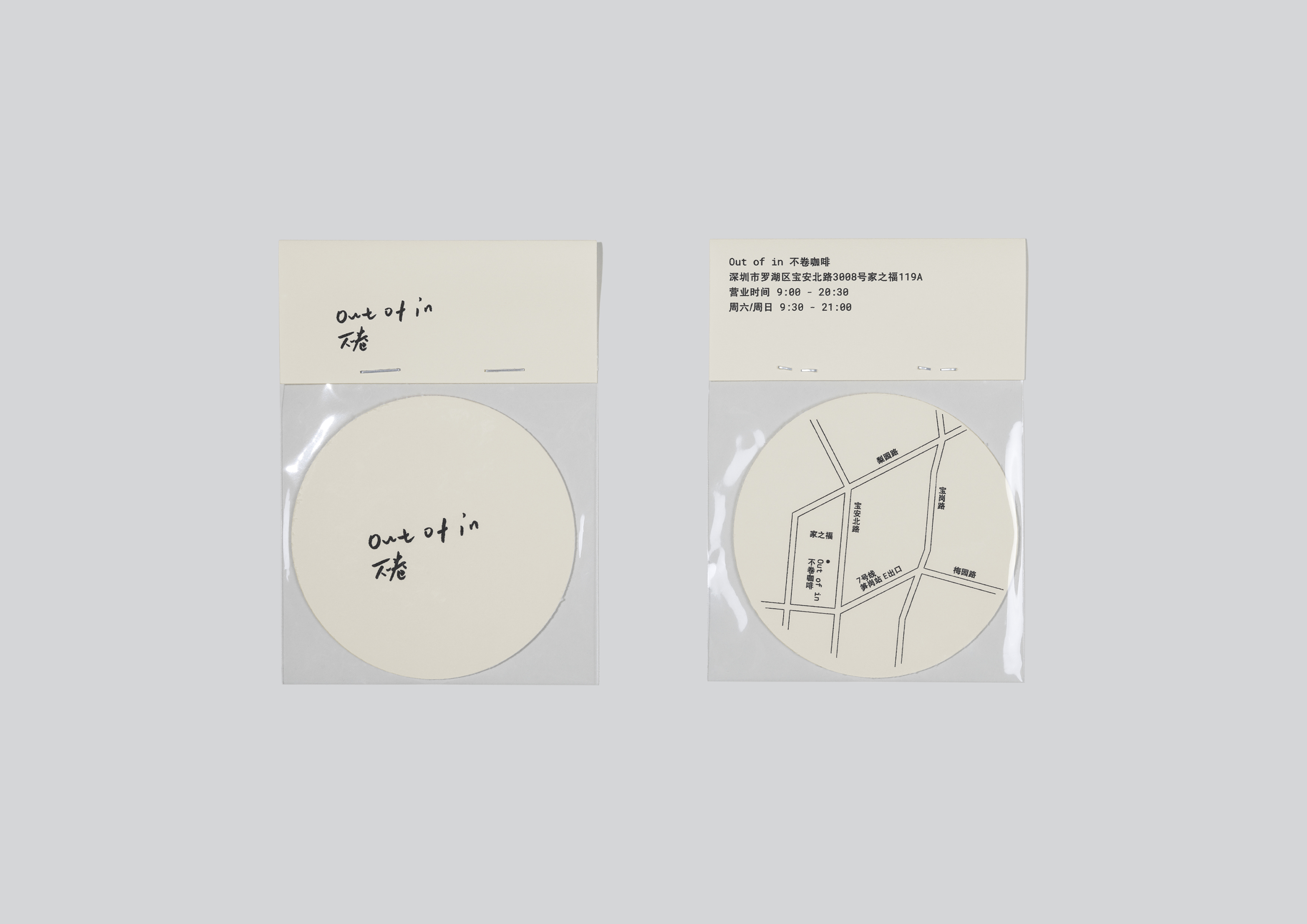
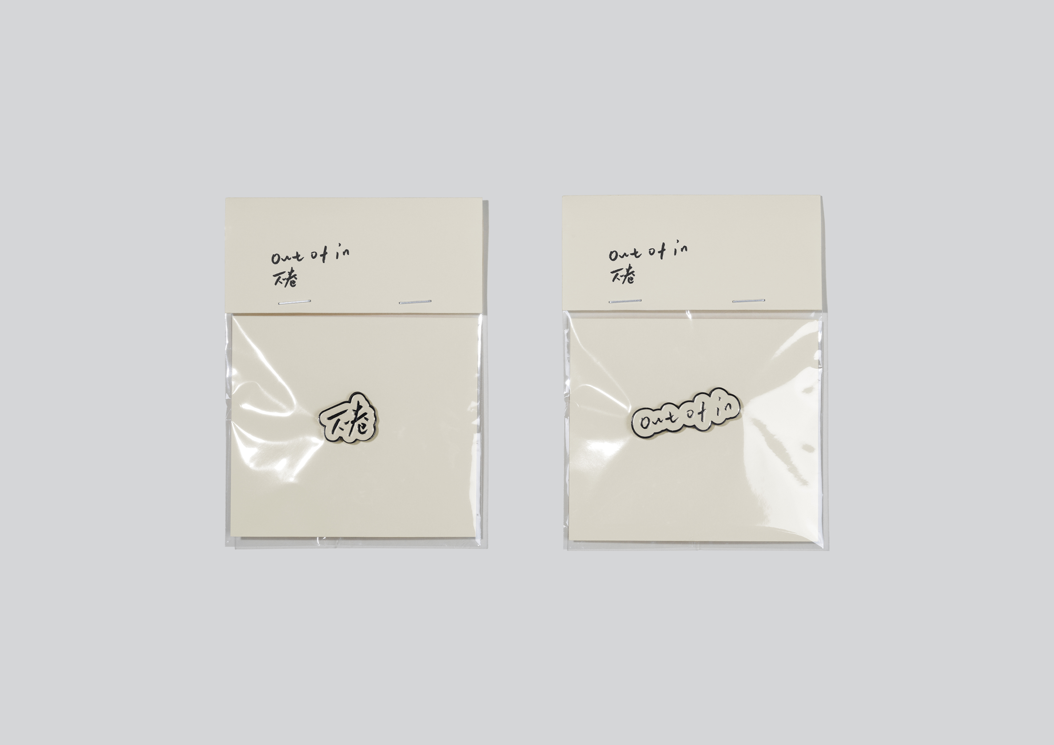
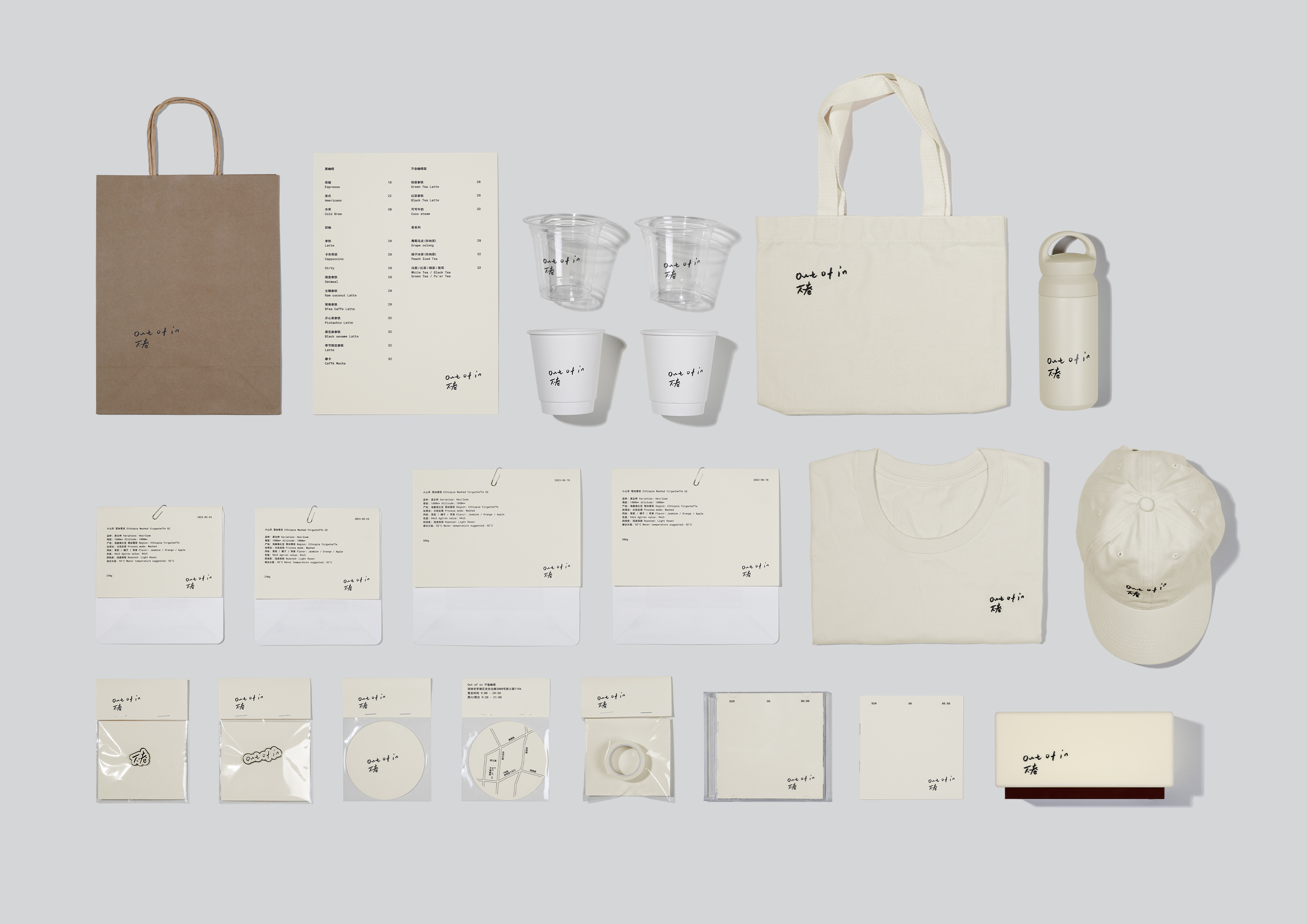
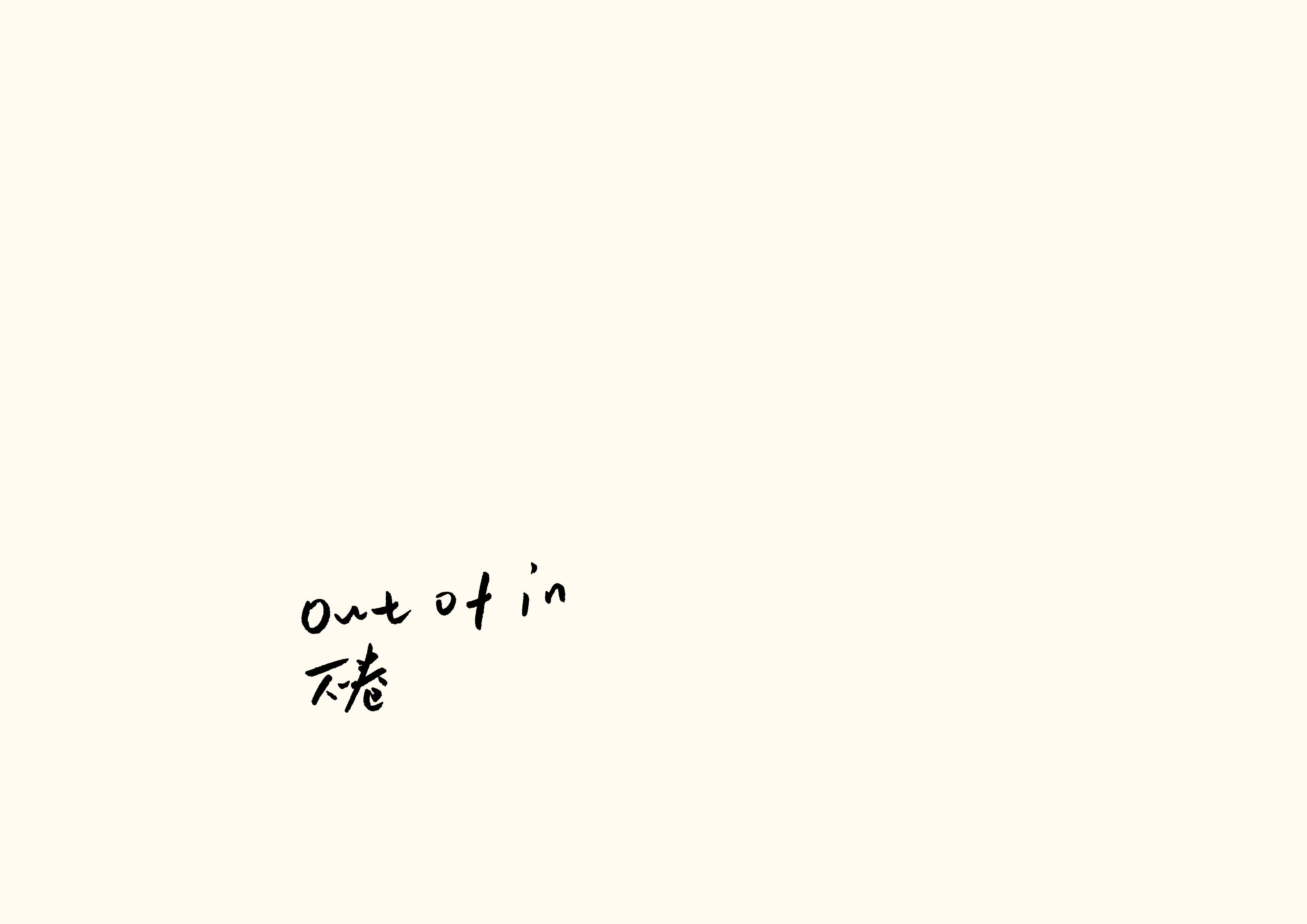
Out of in 不卷
优秀奖
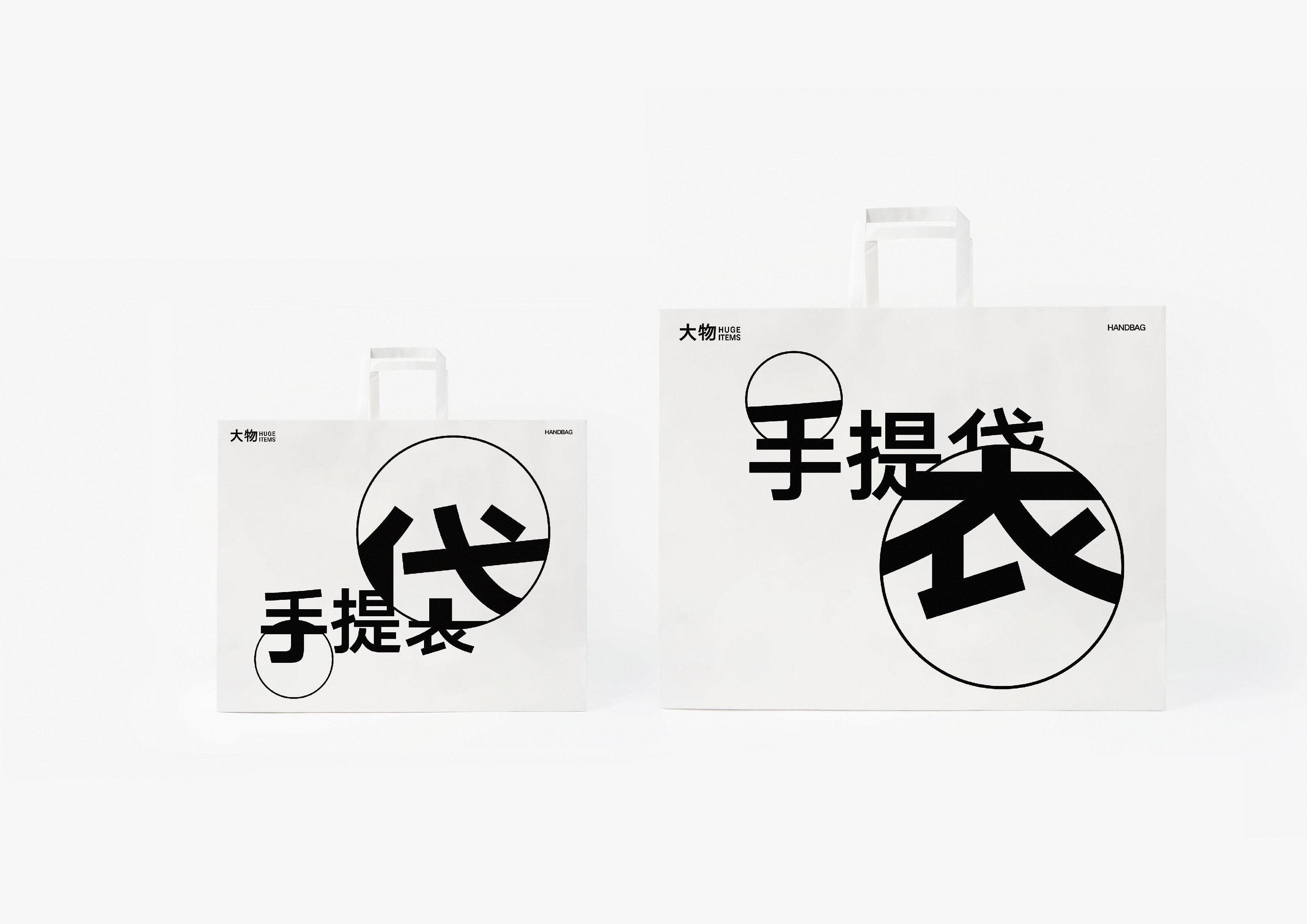
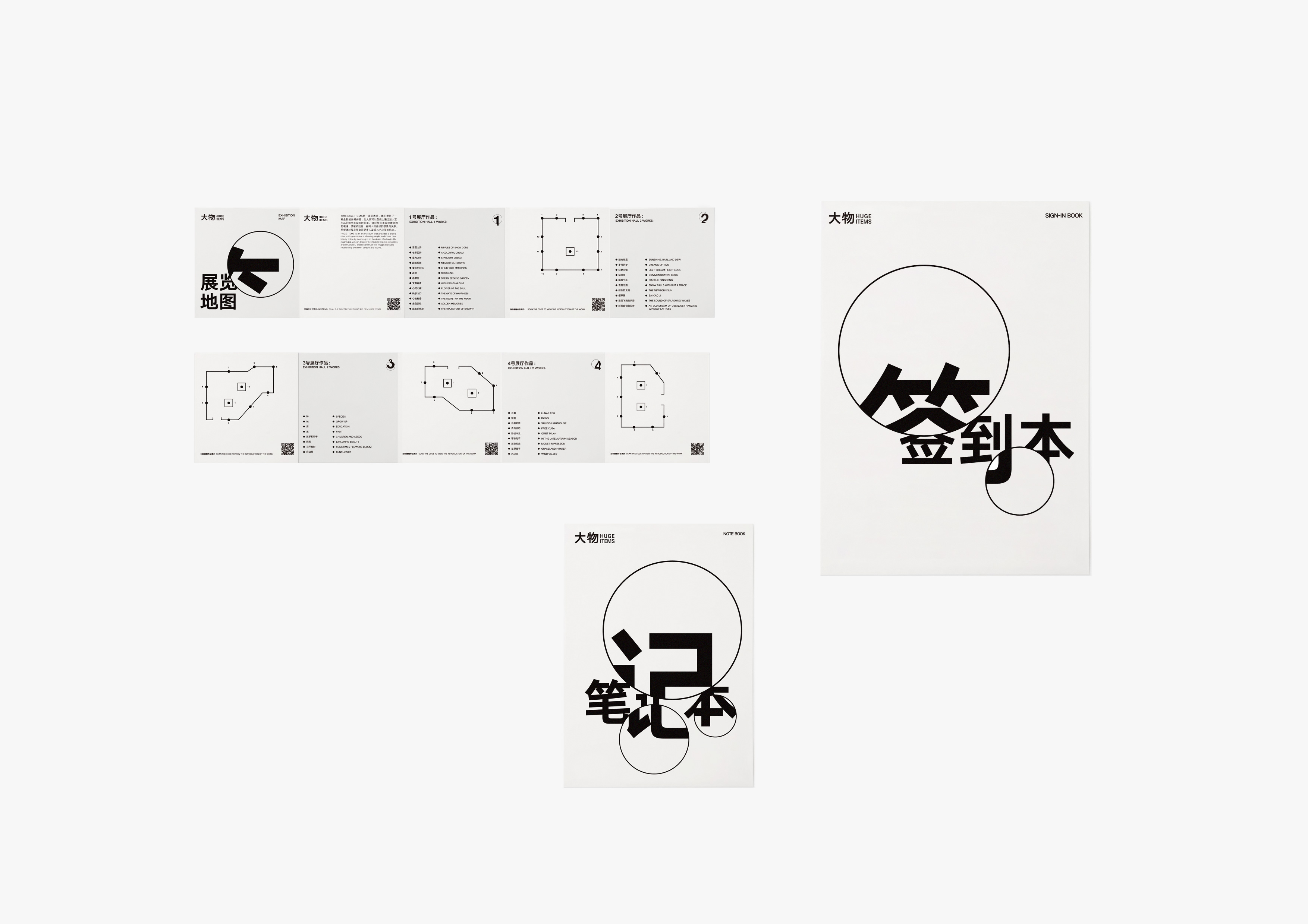
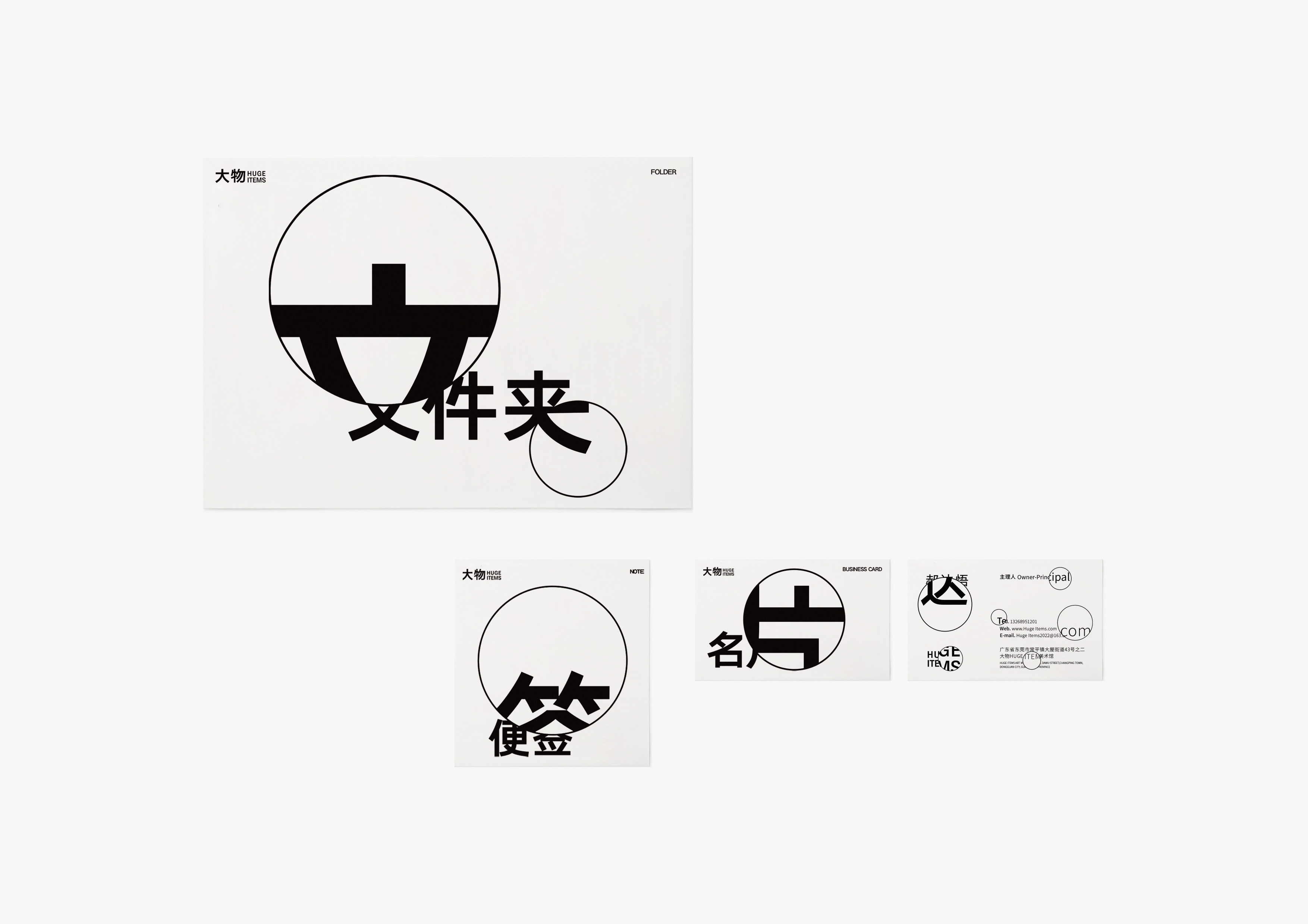
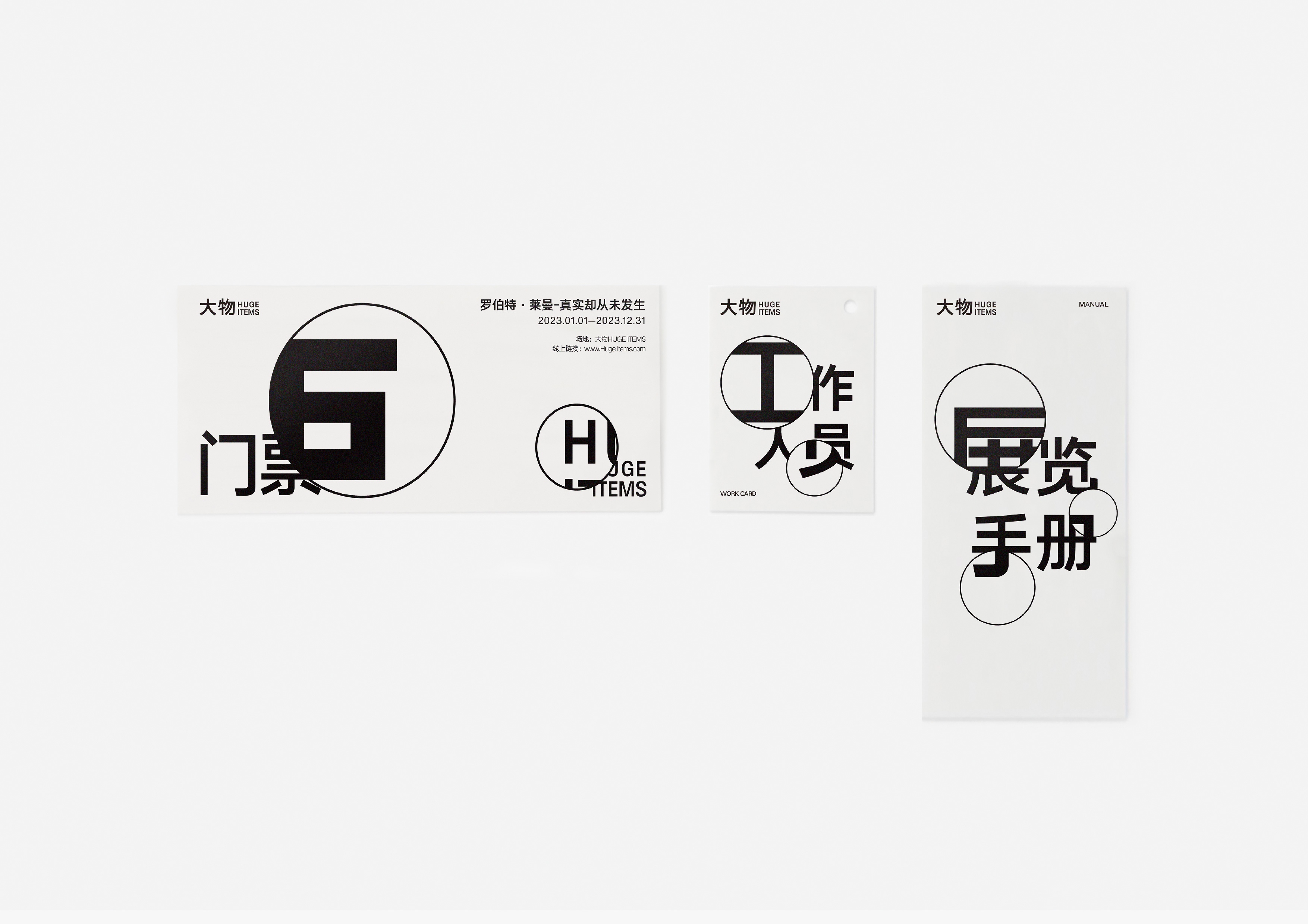
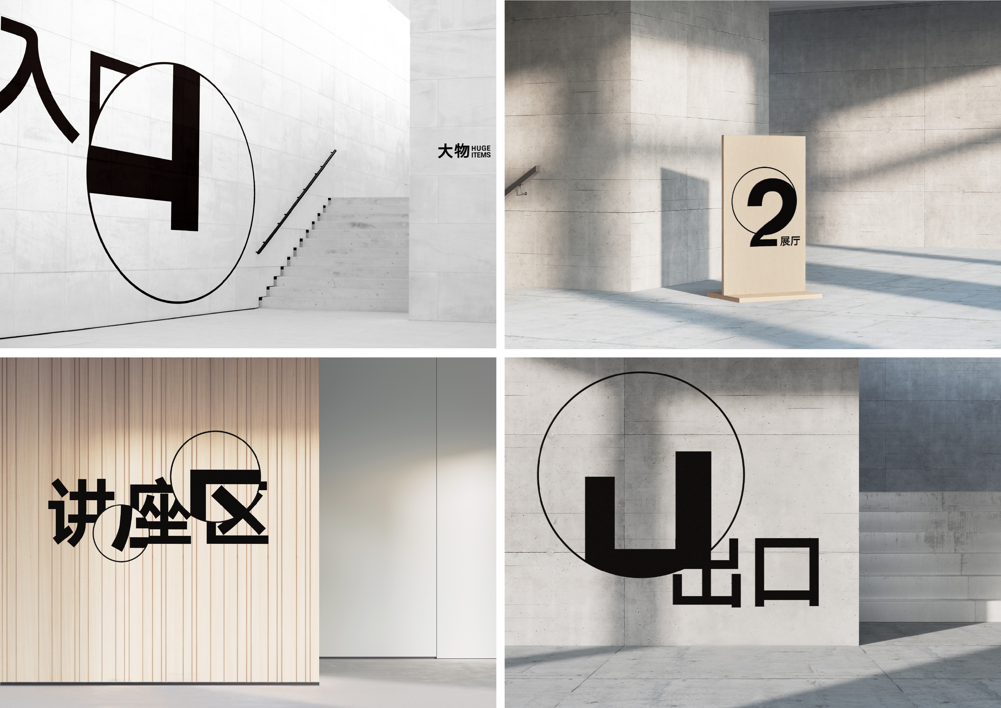
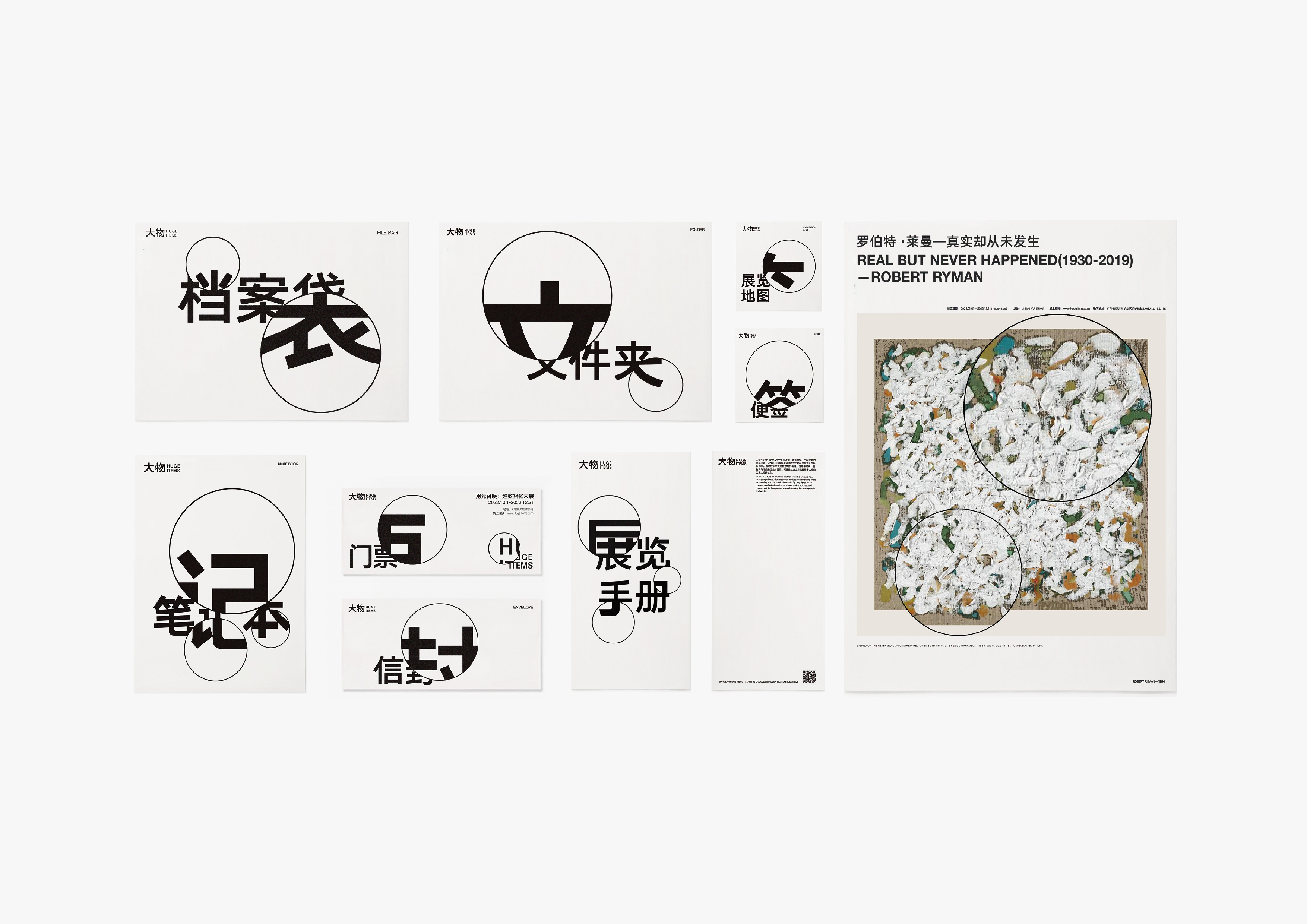
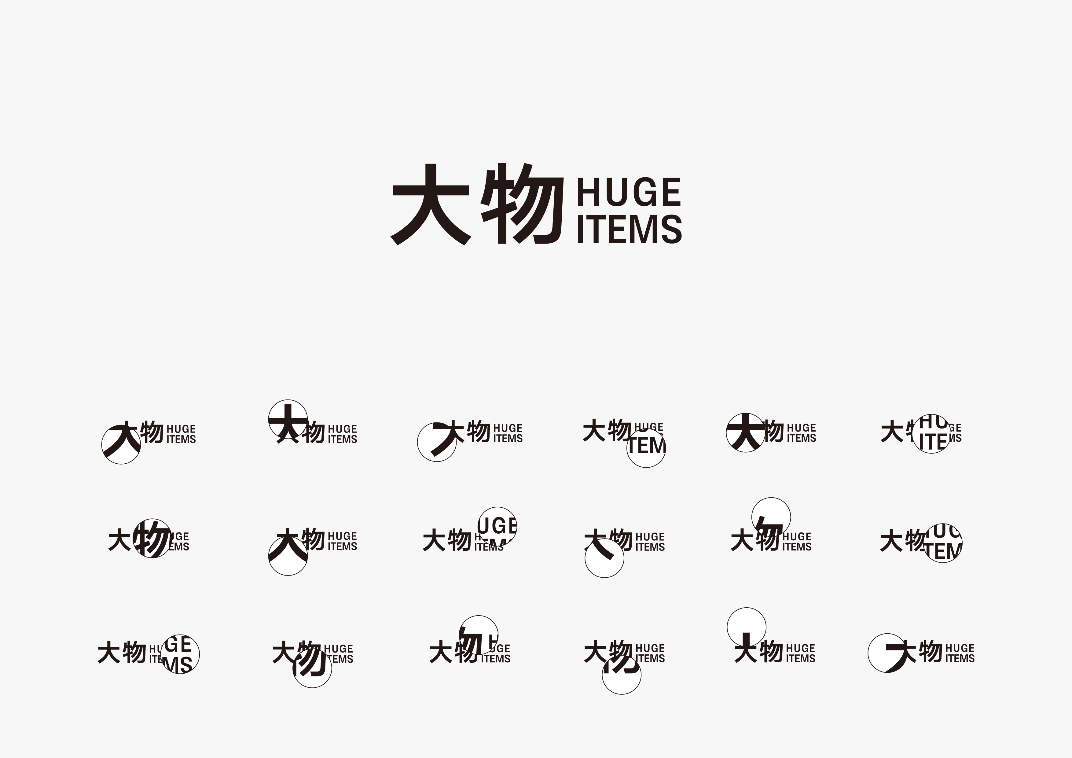
大物HUGE ITEMS
优秀奖
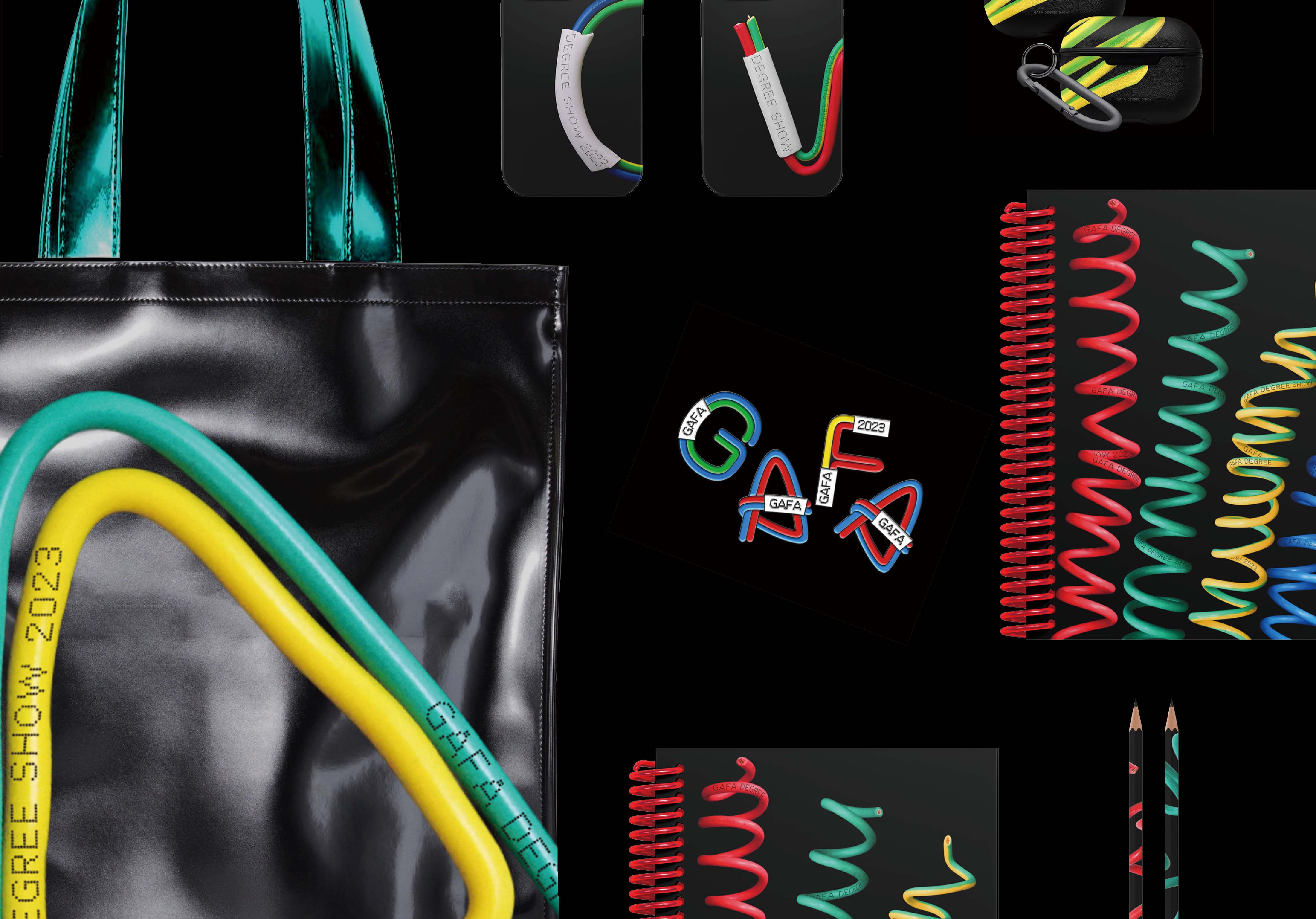
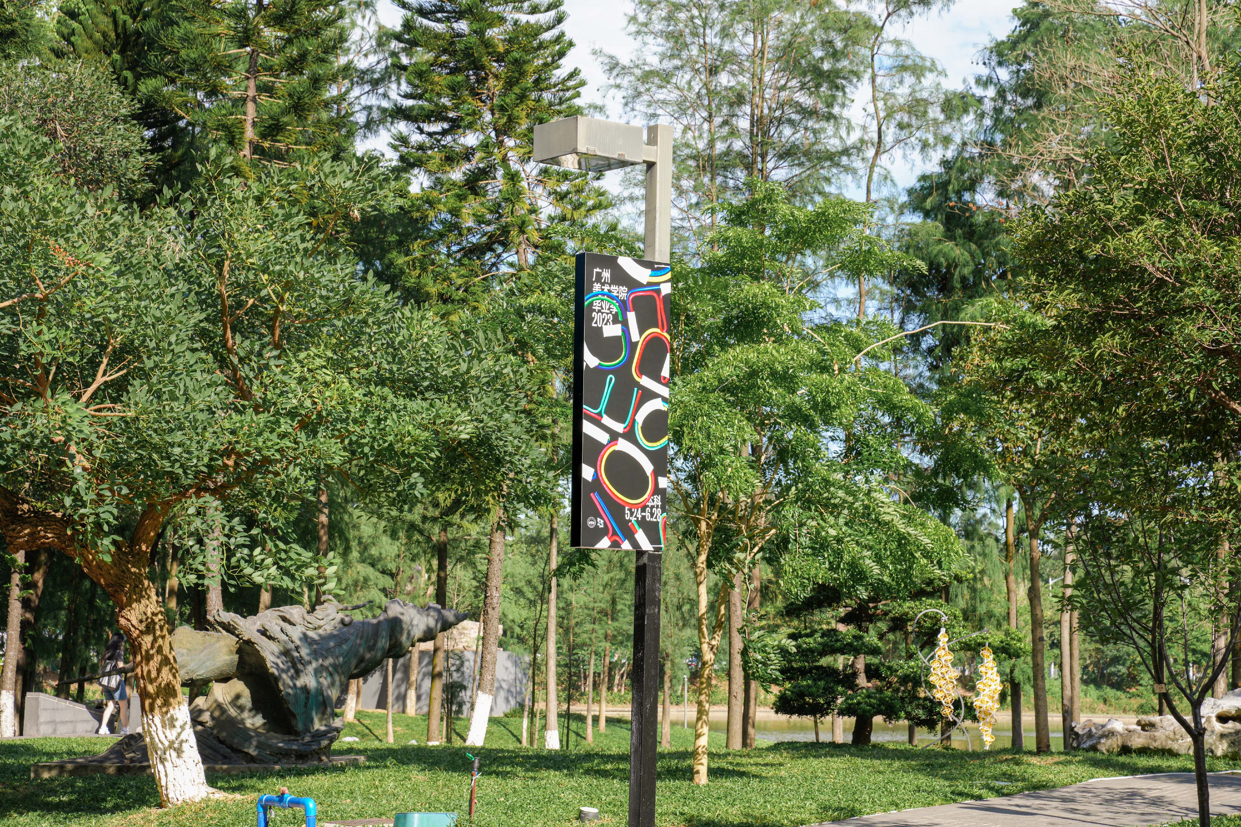
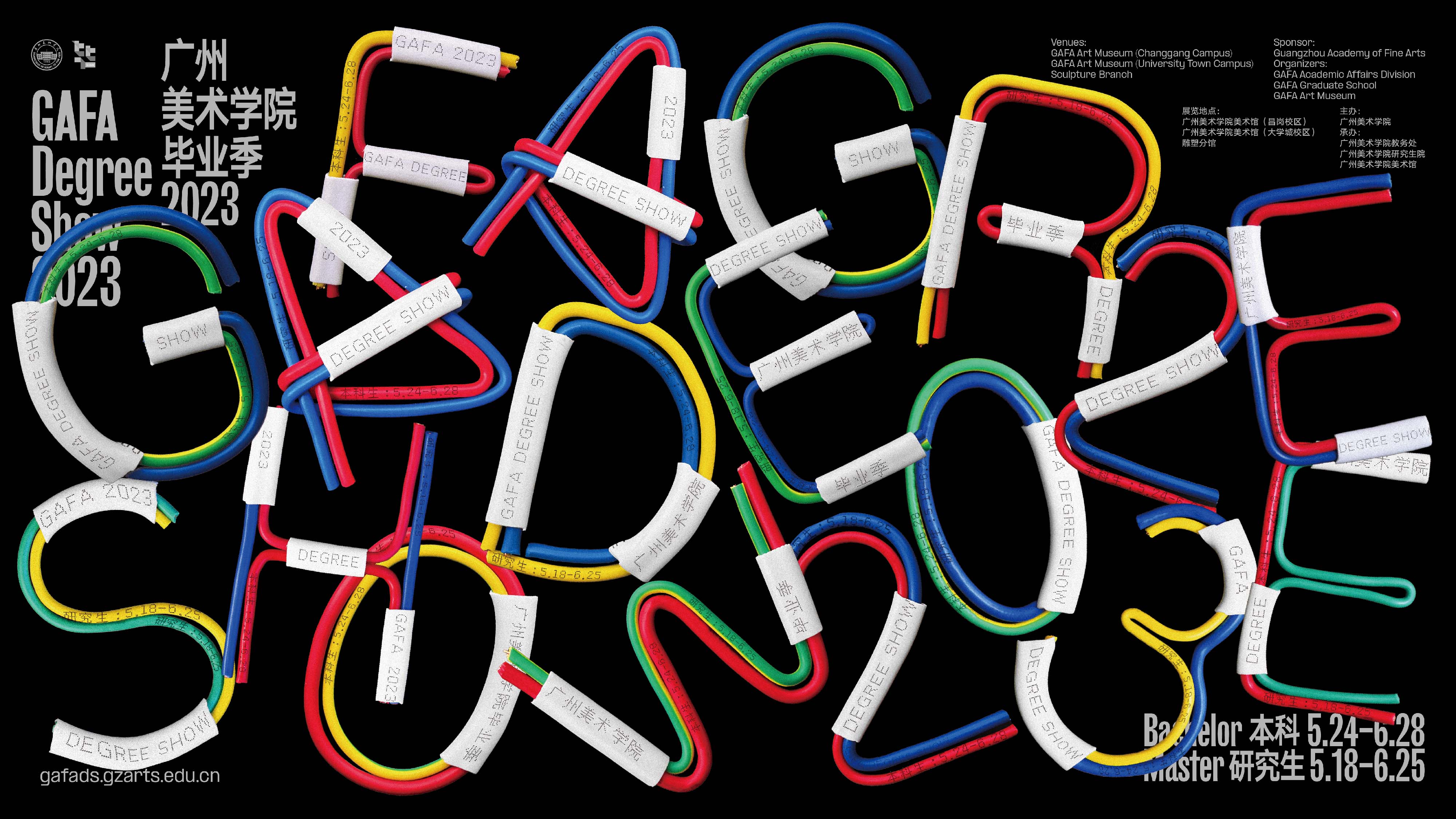
广州美术学院毕业季2023