系列作品
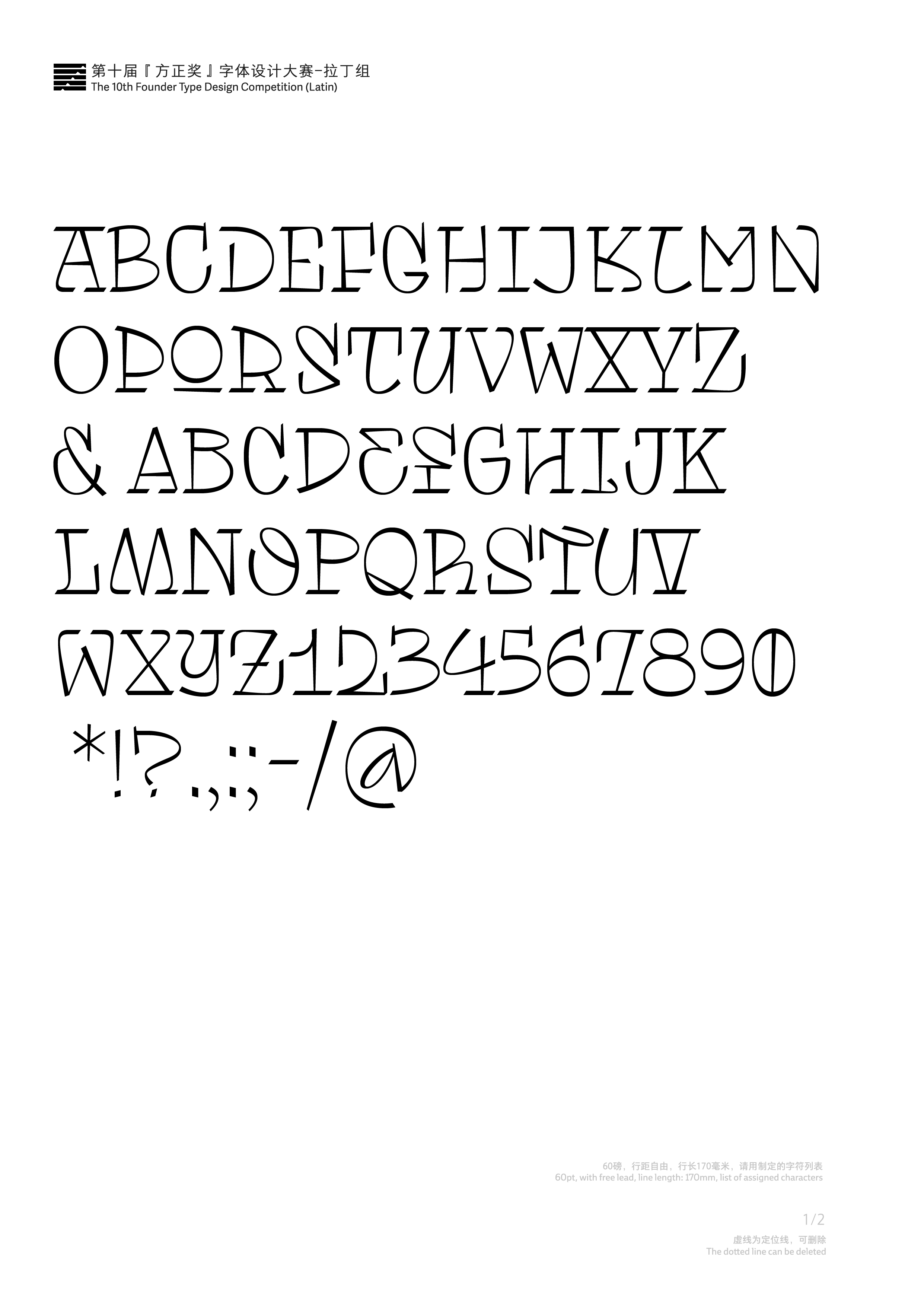
一等奖
Tomasa
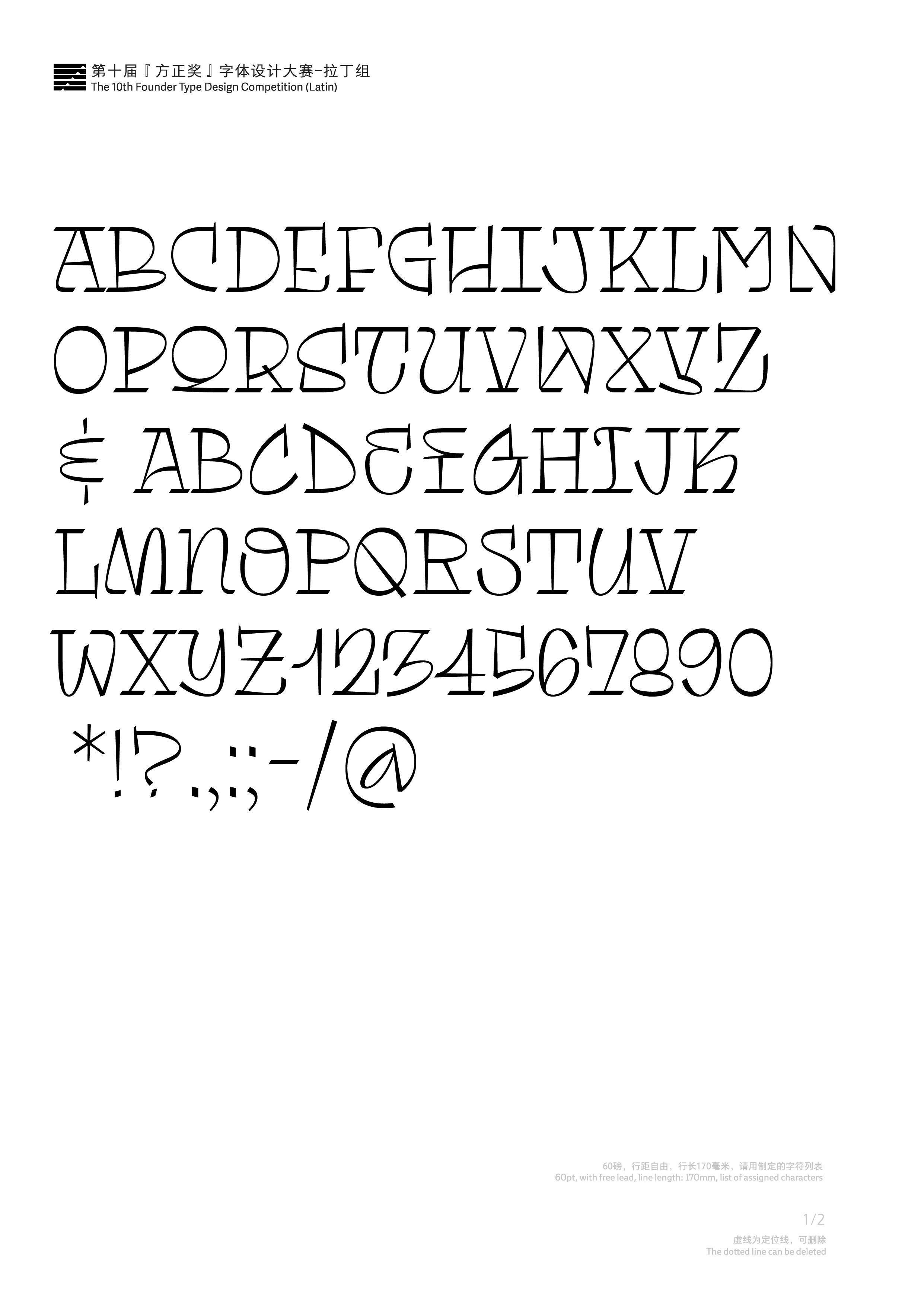
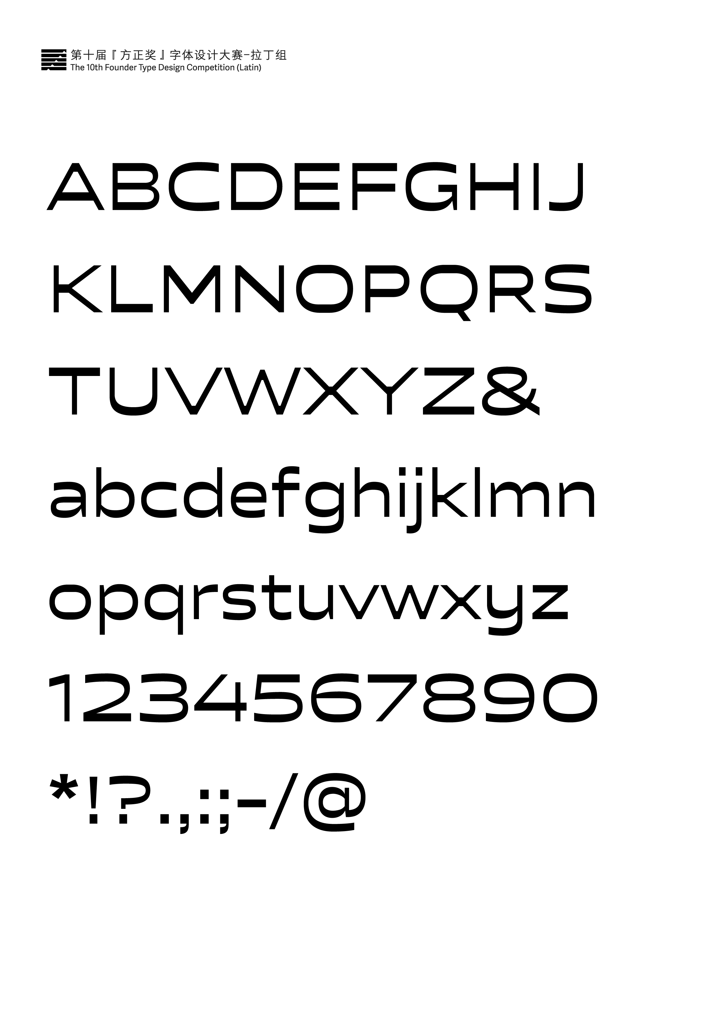
二等奖
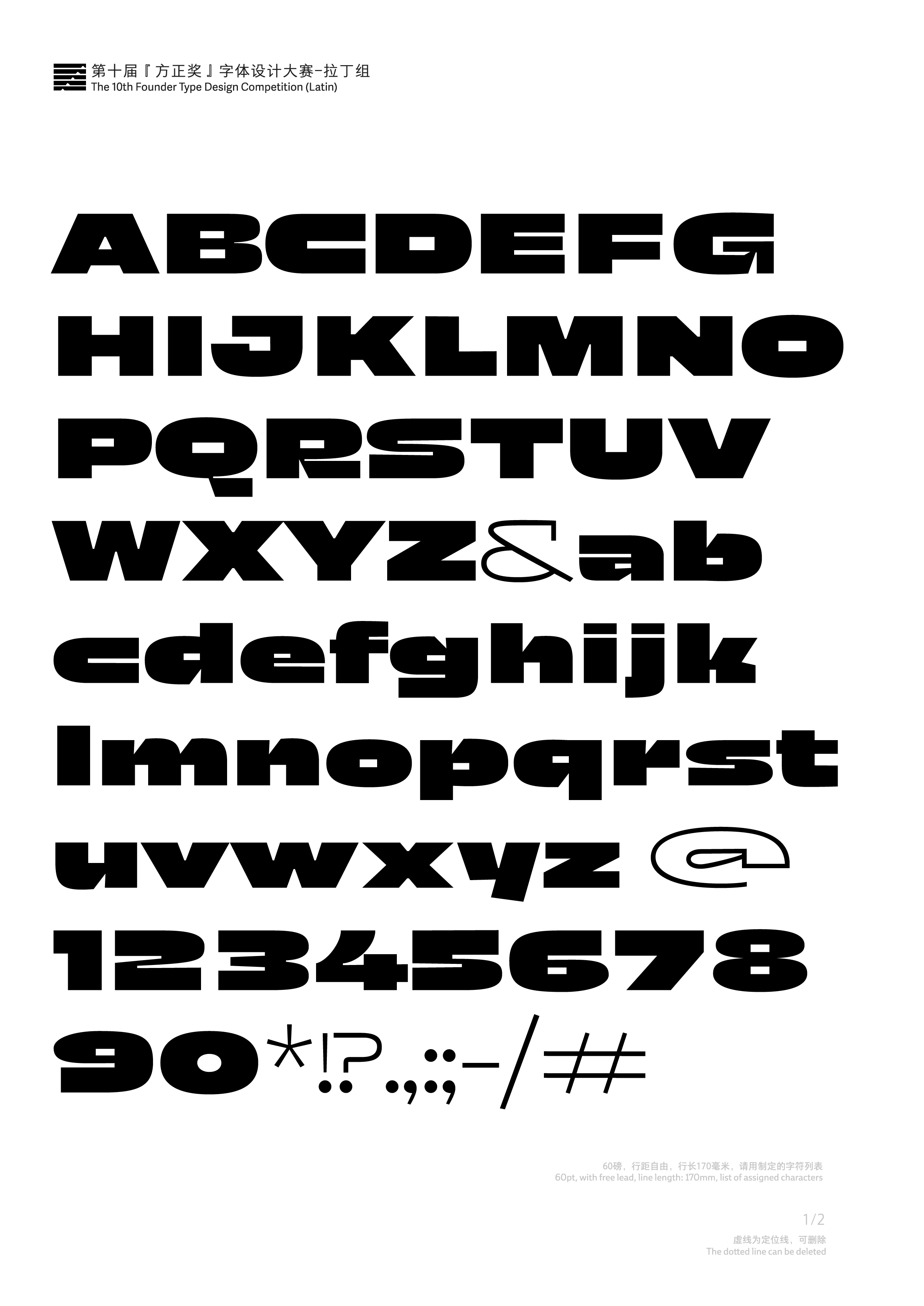
Off Sans
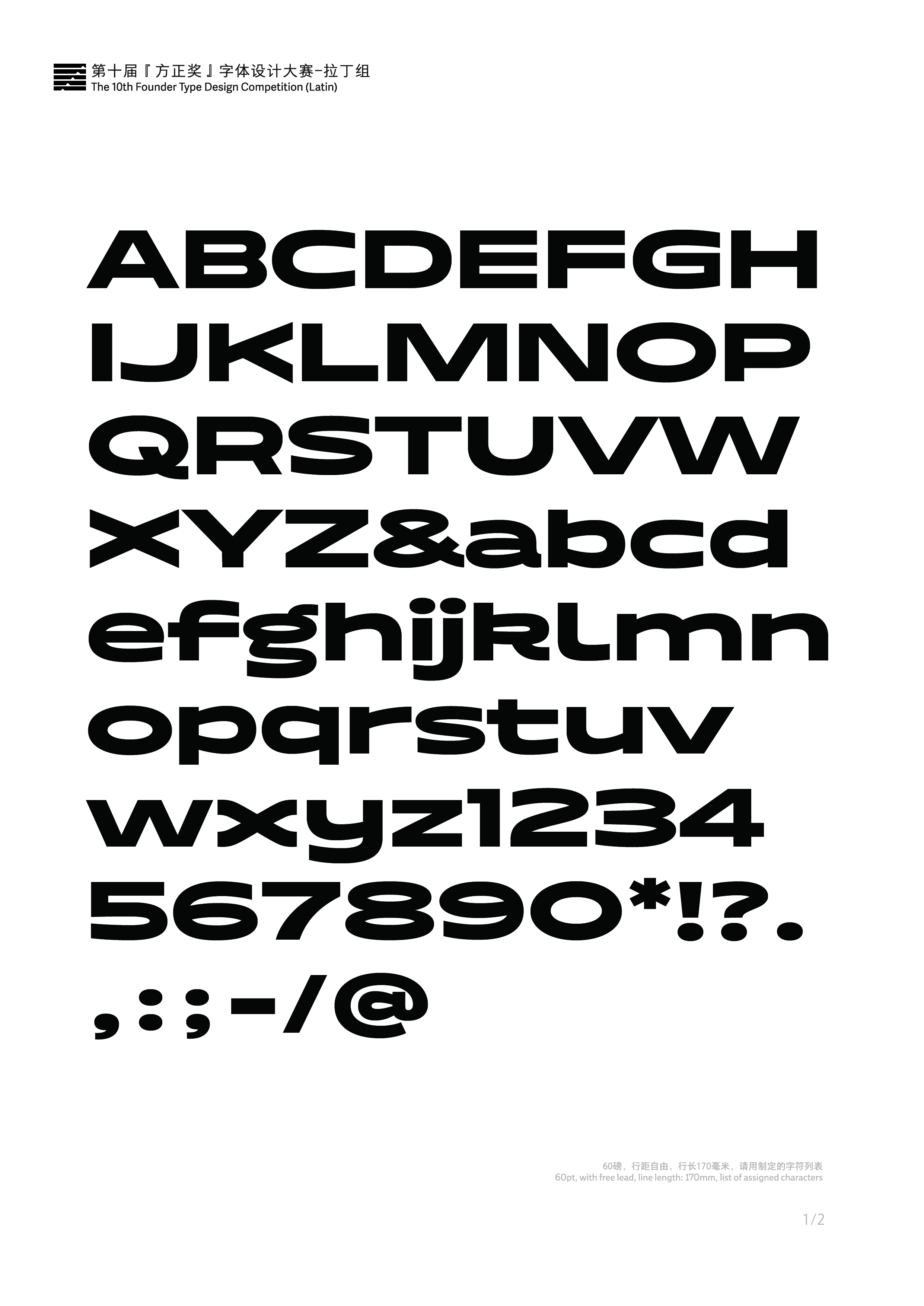
二等奖
烟蒂的记忆
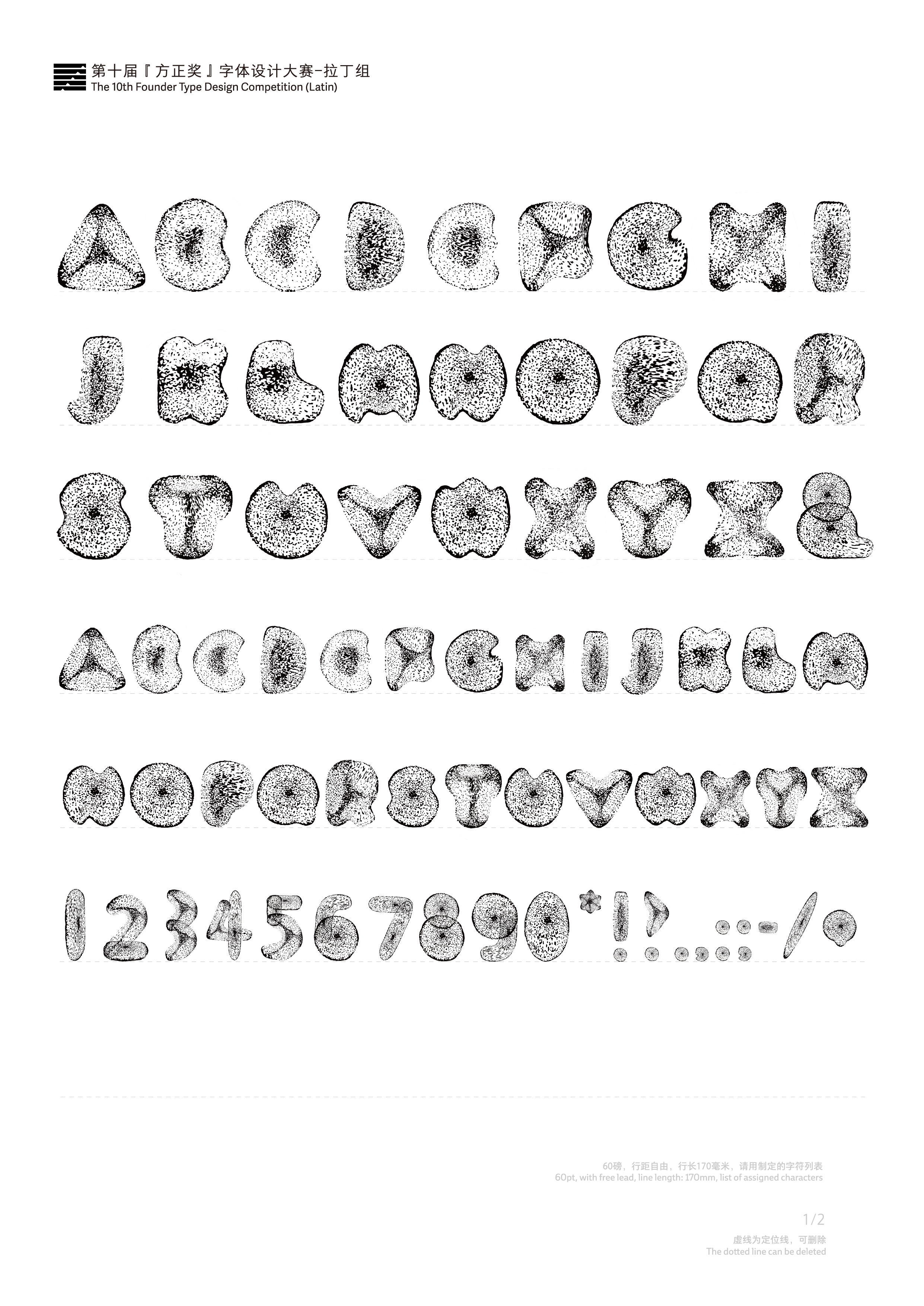
三等奖
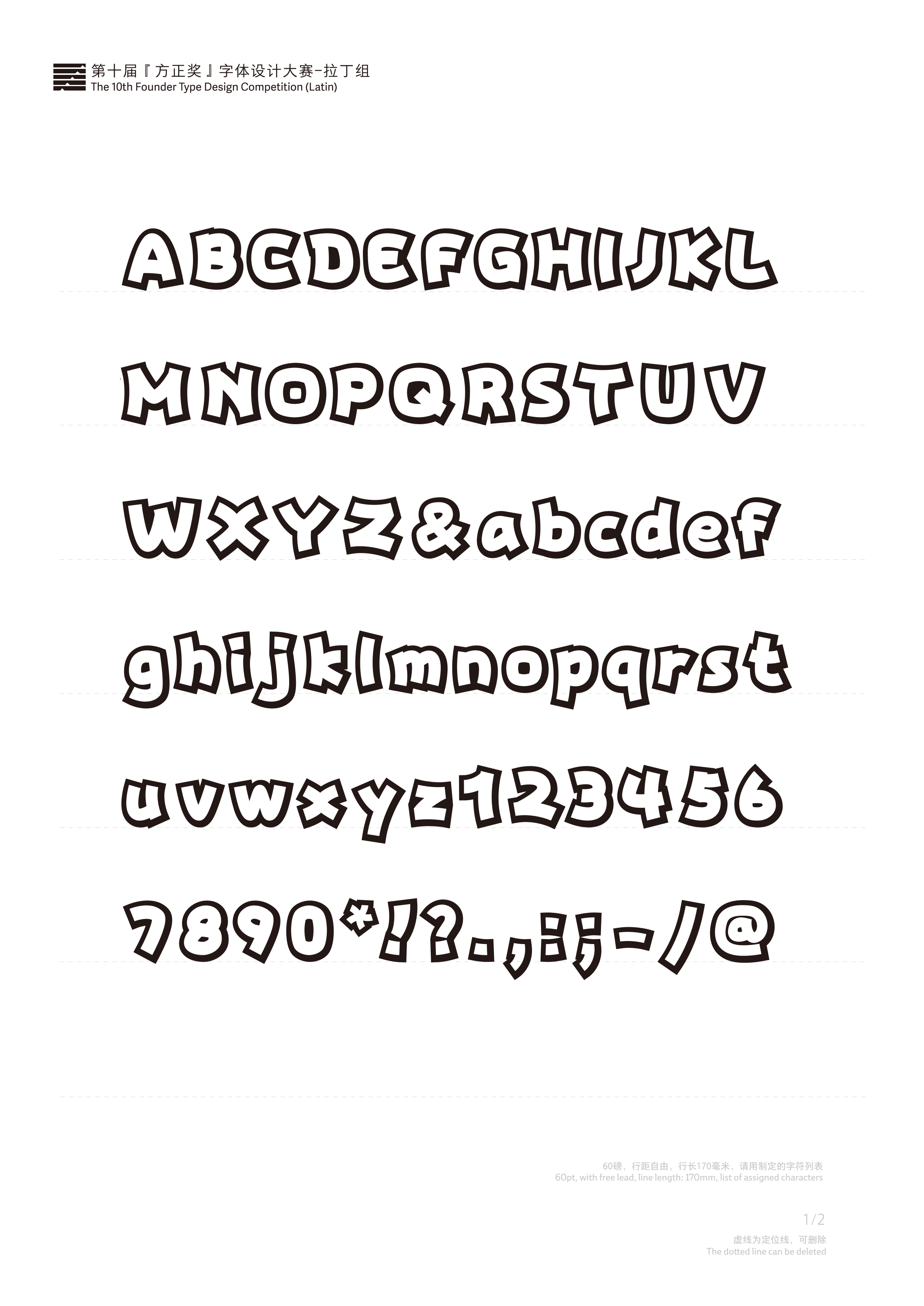
Lemon pop
三等奖
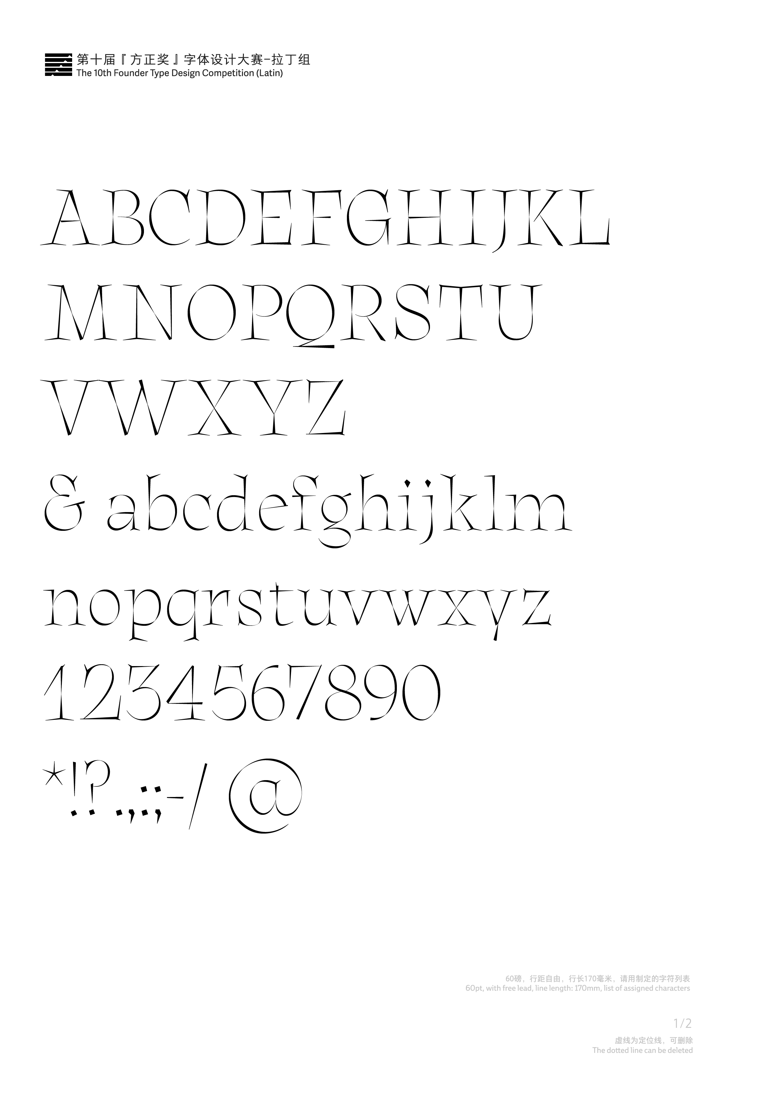
Aidé
三等奖
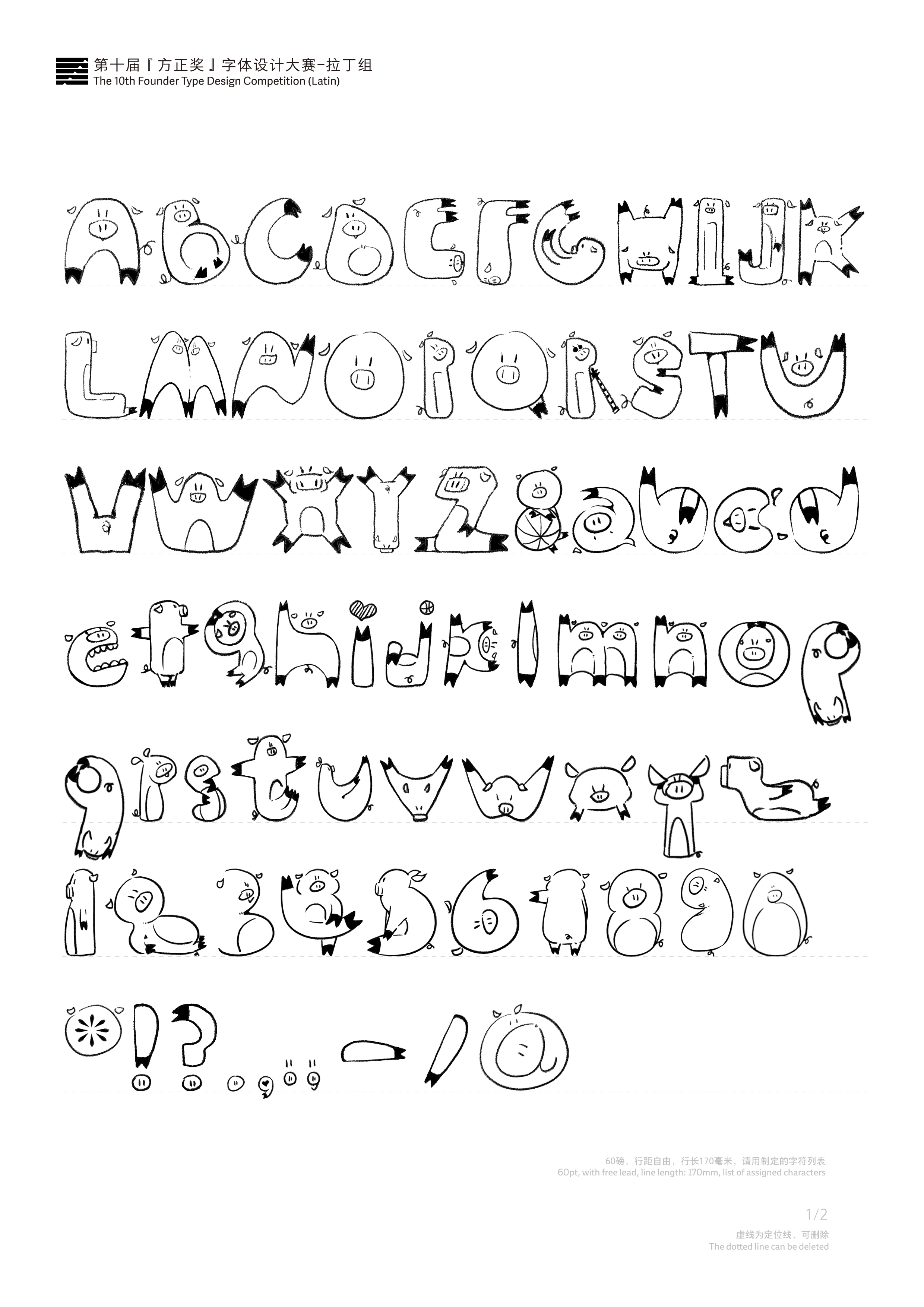
The free pig
优秀奖
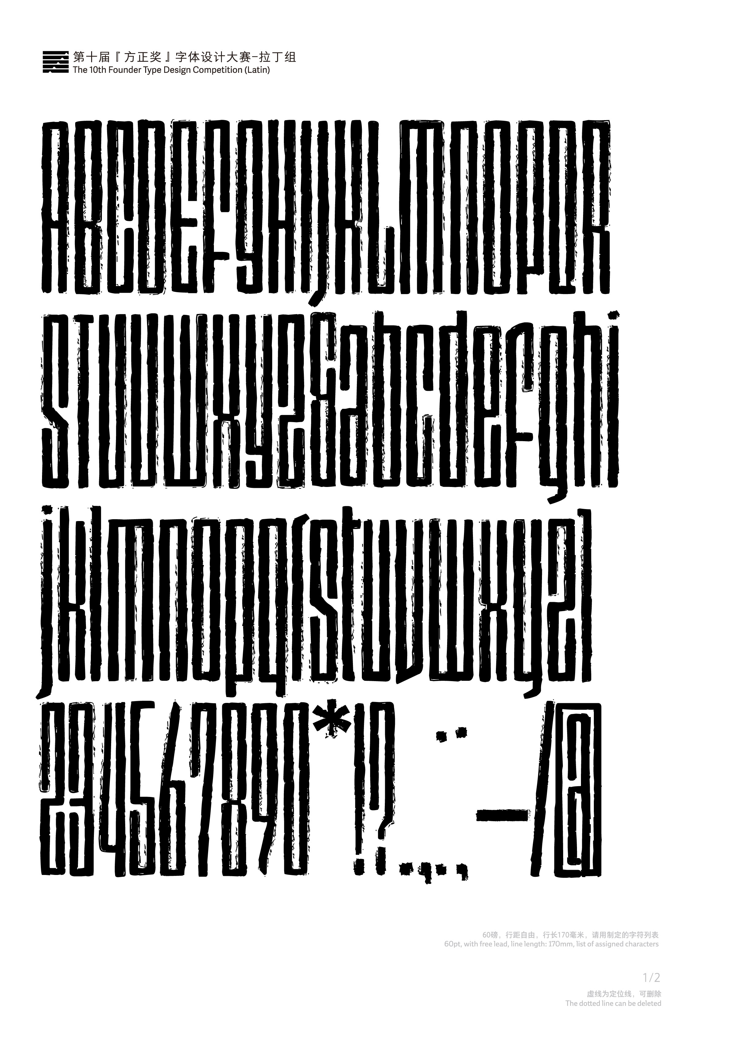
Stray Nova
优秀奖
秩序1
优秀奖
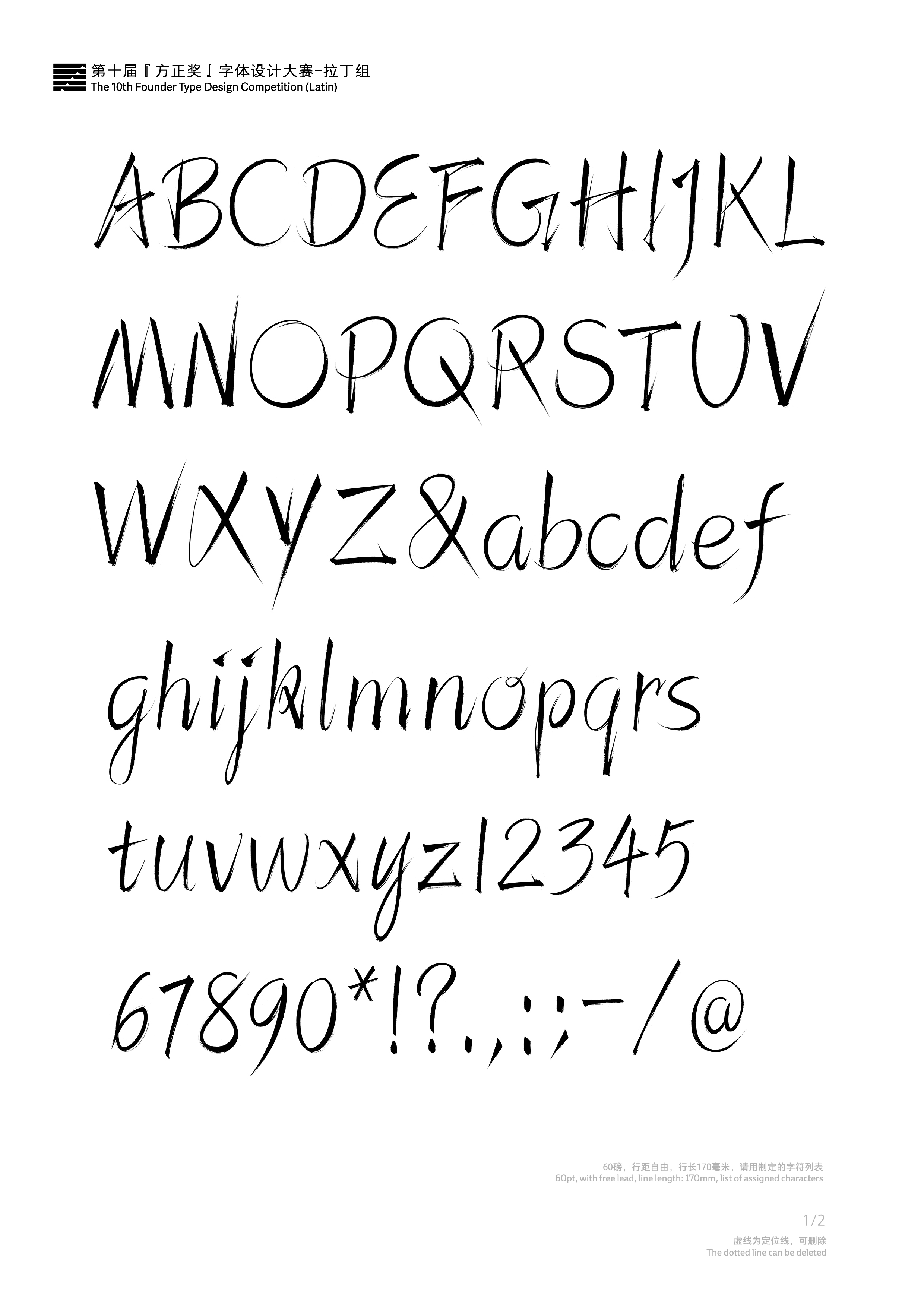
剑锋体
优秀奖
Gabriella
优秀奖
Always
优秀奖
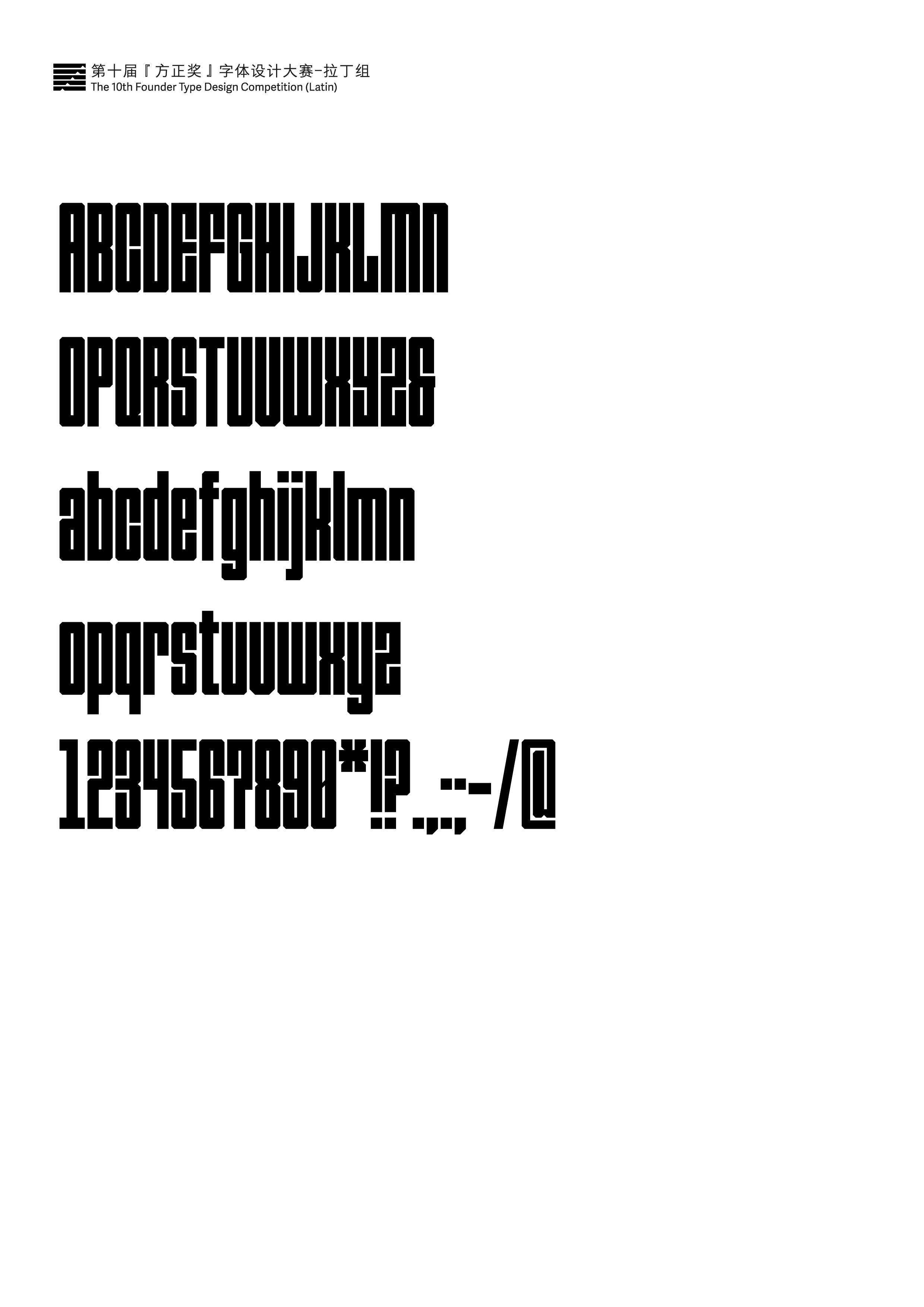
机械宽体
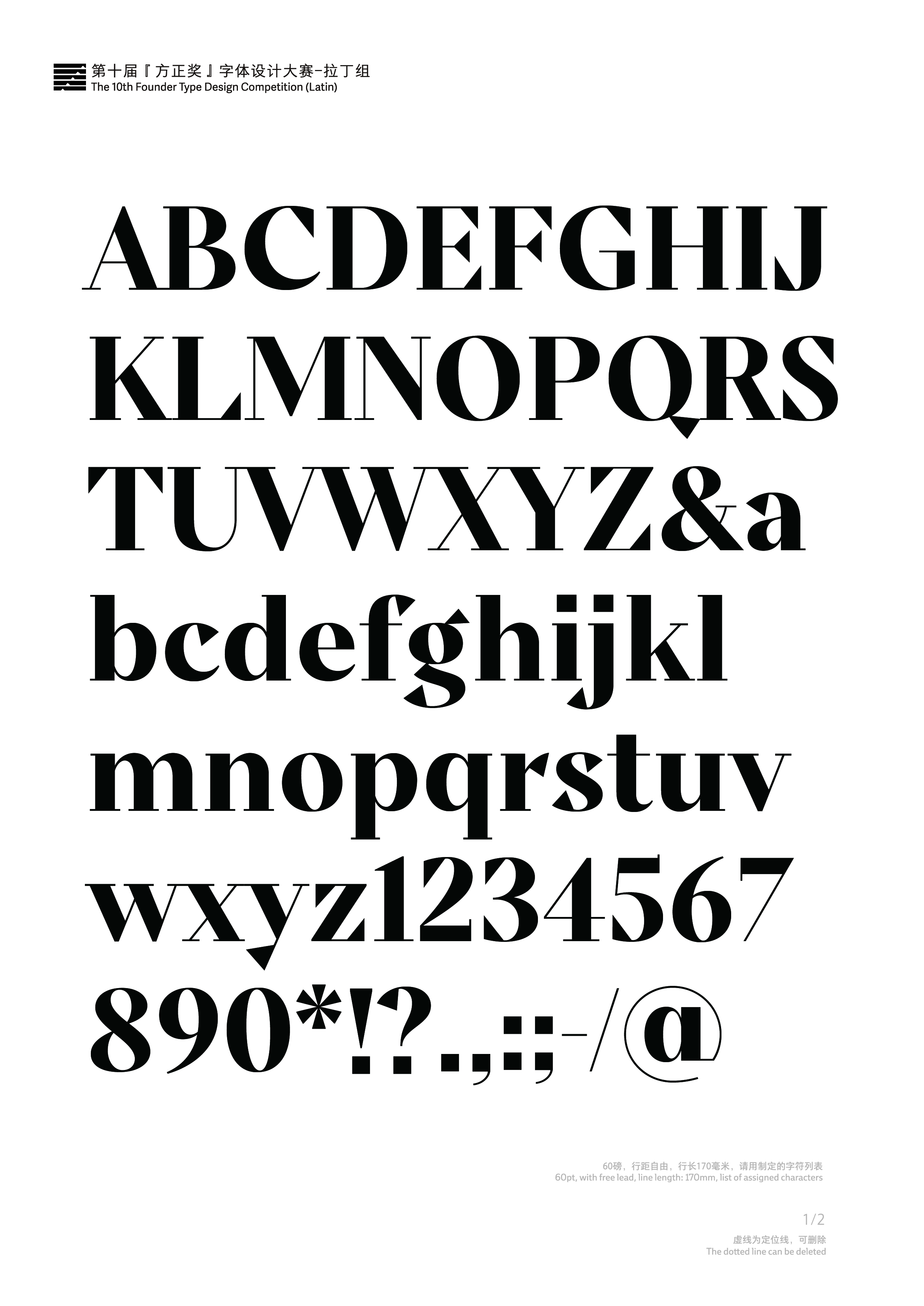
优秀奖
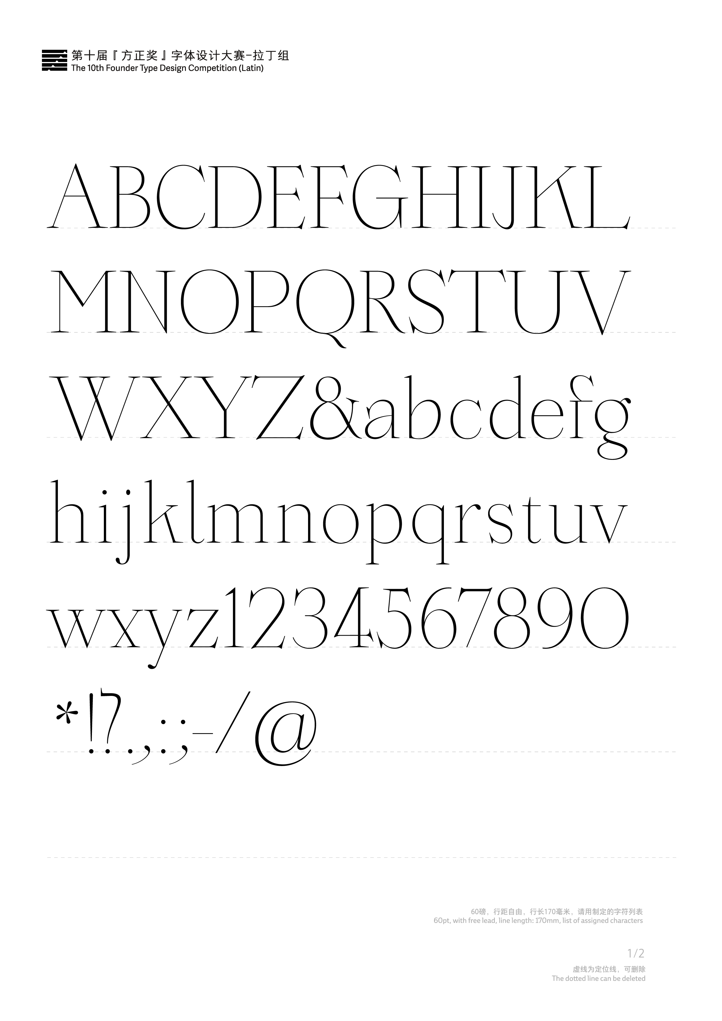
Pure Serif
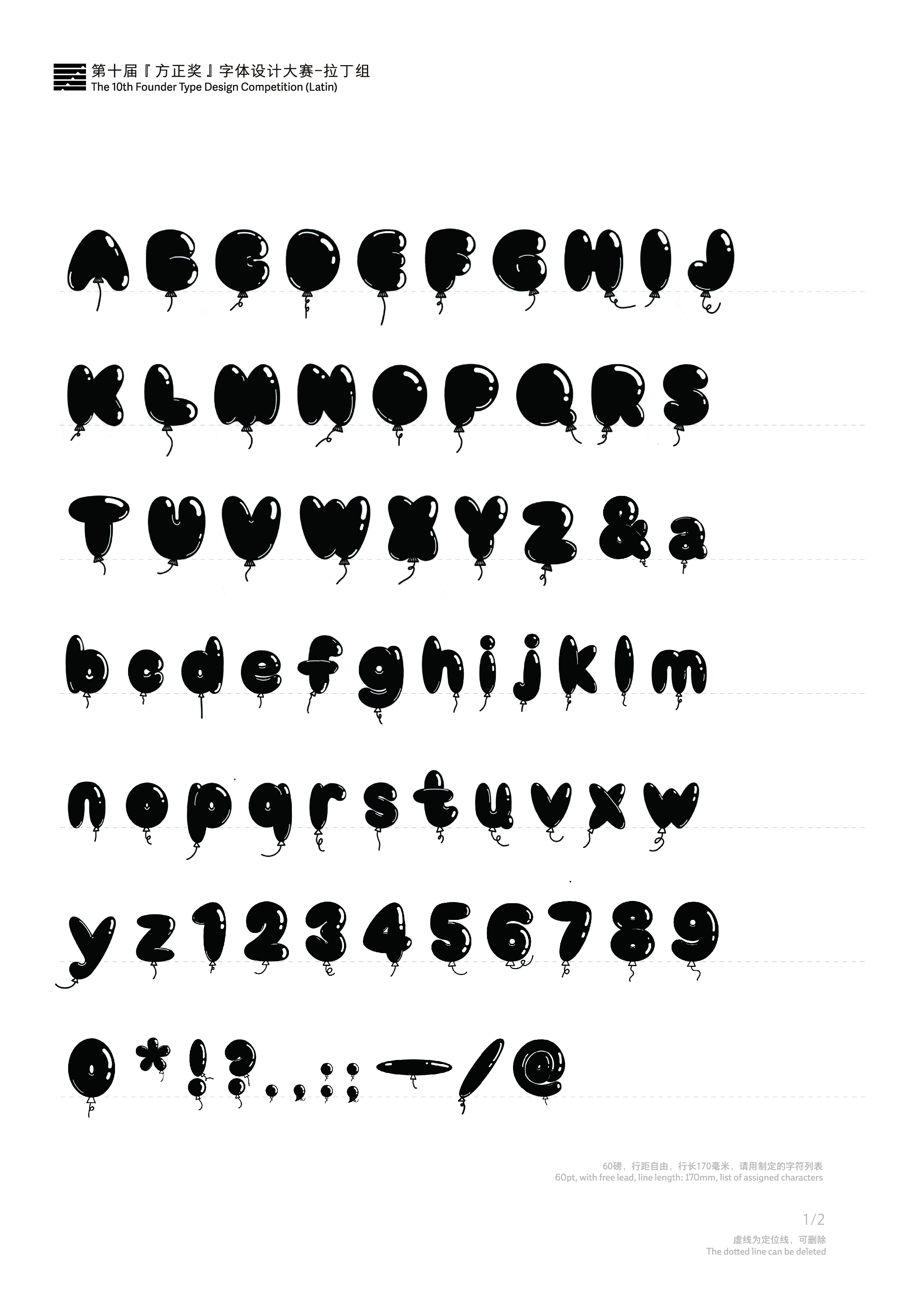
优秀奖
童趣气球圆体